Tuesday 29 March 2011

The Events Page Carried On

In some ways the events section is one of the most important pages of the website, if not the most important as it is the section that will inform the audience of that is going on within the charity. It gives them the key information and quickly if they want to get involved. I have done this through the interactive map so that they know where it is and don't have to deal with a lot of information. It gets the audience involved in the website.

My next aim was to make the individual events stand out in a similar way to the information. I did this by redesigning the calender icon in photoshop so that the text stands out. I altered the CSS in dreamweaver to make the a block space for the image with a margin to separate the text.
See the .supporters for the CSS I added to it.
However the text wasn't clear enough so I made the red section of the calender bigger so the text was clear.
Code for calender image above
Here come the Modx bit. I created a template variable called {{list-events-tpl}} it sets teh date, tells the links to look for [~+id+~}, which means look for the div id with the styles and pick up the date [+date+]
Final result of icons highlighting the events

Attracting and keeping the audiences attention of the events page

My goal for the Events page was to create a format that would make it easy for the audience to know exactly when, where, who to contact and what website to visit quickly. So I have used icons along with a bold title to make the information eye catching. This means the audience doesn't have to spend ages searching for information or get bored of looking for it.

To add in the icons I had to create a div id for each, changing the name of the image, adding a class to position the icon and I referred it back to [*Eventphone*],[*Eventemail*]etc changing it for each icon so that it picks up the template variable that will style it in Modx. The * means that the template variable will refer to the page that I am now on.
The code above create the icons below
That I then styled into all of the defining icons. At first it was adding the email icon in the wrong place so I had to take out

Final result of specified event page

Sunday 27 March 2011

Adding Up-dateable Content in Modx

I have constantly been in contact with the client about what content she wants in the website. She has provided me with a word document, containing all the information, photos etc that she wants included in the website. From there it is my job to ensure that I provide a easy to use, flowing way that she can update the content in the future. It also has to be in a way that fits the style of the website.
Again I have followed the structure of the previous pages of adding content (within Modx). The client adds the content into title, long title, intro text and then the main content area. Modx styles it according to which area it is put into e.g. the title and intro text will be in a bold, dark blue text and the main content will be in a normal, black text.

I have learnt that it is important to but the text into the document with the insert icon within the Modx interface. If I just copied and pasted it into the general text area in Modx it tends to add code into it from word. However by doing this it doesn't completely get rid of unwanted code it has added breaks instead of paragraphs

at time which I have had to go through and alter in the 'edit HTML' section.
Another really good thing about Modx is that you can alter the content/layout of the website in the front end. I have experimented adding pictures through the front end (only work in the browser you have logged into Modx with).


First you go to the quick edit section, manage picture and choose the files that you want to upload then press the upload button. It then accesses the gallery code that I have created to format the photos.
Final look of the photos.
To create the gallery I have 'nicked' the code from the images that I have on the homepage (3 pictures that can be up date able) however again I have altered the code to adjust the size and position of the photos. As you can see from the screen shot of the code below I have changed the height from 500 to 250 and changed where it links to

The Donate Button

The donate button is a big part of how When You Wish Upon A Star will gain funds. It is an eye catching illustrated graphic that I hand drew and altered in photoshop (using my graphics tablet).

After sizing it in photoshop and creating the space for it (going by the chosen mock-up) within the website using CSS I created a div in Modx. This is the basic code that that any template variables or ditto calls will relate back to. Because it is just a click able image no ditto calls are needed just a link to the donate now page that will give the audience plenty of simple options to donate. By having two options to donate (a button image or text within the navigation it will attract more people). It adds extra functionality and user ability by having two options as different people may respond better to images or text.

After creating the div id in modx I copied the source code back into dreamweaver so that I could work with the CSS.

The supporters page: Modx style

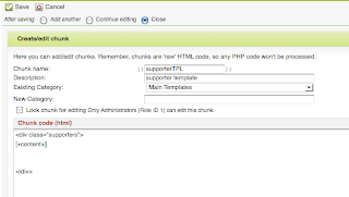
My next task was to set up the 'Our Supporters' page so that the client can easily in put new content. This is one of the pages that needs to be constantly up date able.

This is the main template that I created that will be refereed to in the main document so that I don't have to duplicate code. It will also refer back to this code.
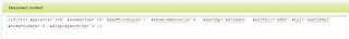
For the template to work I had to use a ditto call. A ditto call is a templating command that lists data from documents to create content in many different formats. Through using a ditto call I have been able to specify what data/layout that the data is presented in.

In teh code below I have changed it so that the content is presented in the order that it is edited on &sortBy`editedon`. Also I have changed &tpl=`testimTpl` to refer to the supporters page template &tpl=`testimTpl` to &tpl=`supporterTpl`. This will get all the correct data that I have specified in the supporters page template.


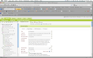
I started by creating a new template called supportersTpl. One of my aims throughout teh website is to keep the text of the website in a simpler format so I have always included text in the Long title, Description (so that the client gets extra guidance of what to write in that section), Documents alias (helps to locate it in the left hand side bar), Summary (intro text)-When You Wish Upon A Star can enter text in here to keep up with the format of the other pages, Menu index-places it within the navigation in a suitable place, Uses template- MainTemplate refers to the styling of the other pages that are under that template so that I don't have to keep duplicating code.
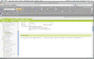
The only other alteration I had to make to this template to make it fully functional was to make it refer to the right page within the ditto call. I changed what parent page that the ditto call refers to on the left hand side e.g. &parents=`206`. This just tell that template to go to the main supporters page that happens to be referenced as 206. At first it didn't work because I had typed in supportersTpl instead of the proper template name that is supporterTpl. This just goes to show that adding one letter can through the code off course. As I have always known you have to be VERY precise in the code used.
Whilst creating these templates I have realised how much using a content management system benefits the user and myself as a website designer as the content can be altered through one ditto call/chunk/template instead of having to keep altering everything in dreamweaver that within a second can change the whole website. Most of all for this project it has helped me learn about what system is used in the industry and how this benefit the client. I am glad that I have learnt more about content management systems as I feel it has made my work more professional. As I have had to learn so much about content management systems in such a sort amount of time I have had to reconsider what my priorities are to learn. HTML 5 and CSS3 have taken a back seat in terms of learning new skills but intend to experiment with them a bit but not include them in the website as the client needs the content management system to be working and look at its best before I delve into that new technology.

The search box

For the search bar I altered some ajax code that I put into a chunk labeled {{search}}. &addjscript='0' means that no I don't want javascript to be applied to this section and showResults=`0` means that no I don't want the results to be shown. 0=yes 1=no within the code.
The only problem is that the search bar appeared as below so I had to apply some CSS to style how I wanted it to look.
This is the CSS that I used to style the search box.

The most important elements out of this section is the image that provides the background for the search bar. Also I made the font height 100%, which applies to the line height being used to its maximum.
Overflow set to hidden to prevent overlapping of text typed into the box overlapping the search bar. overflow:hidden;
This part is used to style the label 'search' so that everyone knows what it is.
This is to style the text that goes into the search bar.


Adjusting/creating Modx elements

Throughout the screen shots below I was creating details that are going to be displayed on the right hand side of the page to give the audience specific details of when,where, cost, contact details and the venue of an event so that it is easy to find and in a structured format.

1) First of all I had to create a chunk. A chunks purpose is to refer to code so you don't have to duplicate code. Below I had to alter which part the code is referring to within the chunk e.g. [*Eventcost*]
[*Eventvenue*]
[*Eventemail*]

The * means that it will refer the code to the page that you are now on.
2) That print the text on the page but I still had to alter the CSS to change the colour of the code, which was easy to do.
3) I changed the CSS in dreamweaver
4) And uploaded the CSS style sheet (this is the general method of uploading the CSS I go through each time that a style change is made and the back end is dealt with in Modx).
5) Final result of bold, dark blue text that defines the major details of each events. The client can go into Modx and adjust the details.
Although this was a simple task compared to other tasks I have done in Modx I think that is an important component because it is forming a structure for each page that the audience will find simple to use as they will immediately get used to the structure. This will make the website easy to use because of the flowing nature of the site. Where ever you are on the site you will be able to navigate to where you want by the main navigation, the footer navigation, the search bar and on each page on the right is has elements that relate to the topic you are on so the information you need is easy to find.

Wednesday 23 March 2011

Creating an interactive map through Modx

The client has requested that I created a map of England that highlights their main offices through the country and what events are being held in each area. I have drawn a map in photoshop (using my graphics tablet). The events need to be assigned to each area so you can click on the area and it will take you to the events page.

There have been a few dilemmas that I have had to solve through this request:
  • What if there is an event that is held more than one of the regions?
  • What if the event is in an area that isn't highlighted as a main area that events are held? (see below for how I have dealt with these issues).

1) I created a template variable. A template variable allows you to bring in a template where ever you like throughout the website so you don't have to keep individually code the elements.
2) I had to tick the option to publish this page as I duplicated the page from the template that I previously created. I gave it a different name (within the code in modx). Modx works like a database system in the respect that it allows you to set options of the template variables to change the appearance. it then adds javascript code in to dreamweaver to set the design.
3) So far I have got the content to layout simple text that is calling the information that is needed to format the events. However I have run into my first problem-the time isn't set put properly and it still includes events that have already passed. My client needs it to only have present and up coming events.

4) This is a ditto call. A ditto calls purpose to command the template. It can also list data from other documents and create outputs in many formats. You can also specify what data goes in and how it is laid out. Within this ditto call I had to change what are it is referring to (that I have already labelled in dreamweaver).
5) In dreamweaver I drew in links to define areas of the country that will act as a button to connect it to its event page. I went to properties-hot spots-choose the 'angled' tool-drew round the are that needed to be defined and gave it a region name.

The client asked if I could specifically created links on the map for Scotland, North East. North West and the Midlands as they all have offices that need to be able to send their content to the main office where it will be up dated (in Modx) by my client. I also created links on other areas of teh country in case there are events that are organised by a certain office but are out of their area. I thought that this would give them flexibility in the future in case events are hosted in different areas that they don't have to account for now.
6) I had to set more templates variables for the fields needed in events, such as cost, place, time, venue, email and phone number of the organiser. I also had to set what order that they would be in so with each field it goes up. They are labelled individually from 55-60 so they will be set in a different place in the code and can be reference through their number.

7) I set a title and a 'long title' as the field that they will type into to describe the events. The long title field has a shorter word limit so I thought it would be a good, quick way to limit their word count and keep it in a format that the audience can follow. It will make it neat and tidy.
8) I set what template it will be linked to. In this case the Main template. I have created a Homeage template and a main template as the home pages design differs from the rest of the website due to the news ticker and donate button. I also set the place the it will be in the navigation (1-it is the first child page that goes off the main events page with the map).

A parent page is the main pages labelled in the navigation and a child page is any page that goes off that navigation.

9) In this bit of code I had to direct it to the right image file and the right are. I also had to change the bit of code [~193~] to direct it to the right area (see child pages on the left hand side).
Through these steps (with the guidance of Chris at ibrow media and his helpful work experience) I have created the map below that link to the events page once the area is clicked on.
Events page (still needs to be styled) Here is the address (but only for a short period) http://s109231681.websitehome.co.uk/events1.html
On the left hand side I have create a box that people can click on to see the rest of the events in different areas so that they don't have to keep navigating back to the map. It will save the audience time and keep them interested as the events will always be updated.

Artefact four: User Interfaces

As part of my research project I have decided to explore different aspects of user interface design and how it affects peoples interpretations of how good the game will be. Judging from my research in to artifact 3 that asked people if colour and bold graphics affects their decision to play the game I decided to experiment with different types of graphics.

This user interface is aimed at 8-13year old as it uses simple, bright primary colours that suggest a tame, easy to play game. Also the text is simple to read and the graphics tell the target audience what the game is about.
I have carried this theme into the first UI (user interface) to provide a sense of consistency. Personally, I think this colour scheme gets the younger audience to trust the purpose of the game as the younger audience are more unlikely to go through the instructions.
For the second UI I have chosen to experiment with the background of the interface to see how this would affect the users choice to play the game. Although this is a simple change I think it will attract an older age range of up to 19 as the colours give it a more sophisticated, cleaner look.
I have chosen to put the silhouettes in the background to draw the eye to the slingshot and constantly remind the gamer of what the games purpose is. The black button and 'tools won' bar instantly stand out to guide the user. It does it through the stark contrast that makes the main elements stand out.


Monday 21 March 2011

Art/game app story boarding

I have designed the story board for 2 prototypes for an art/game app designed for museums. I think that most museums are missing apps that work on more levels than just giving the students a digital tour and ploughing through information. I think for a museum app to be successful it needs to engage the user in a task so that they are subconsciously learning through about art through the game.

The first stage of this app is to give the user options so they can participate in the game to learn or got through the content in order to learn. I am going to design the prototype to 320w by 480 (iphone standards) to begin with as it is the most popular phone on the market and has been used the most in museums to guide people.
The idea of my first art/game app is to find the artist through a shooting game mixed in with the concept of catch phrase.

Aim of the game: Answer the questions as fast as possible so you can shoot the canvas to find out who the artist is.
The questions: Get harder with each level and are all related to the art/artist so you get clues about who they are (like catch phrase). With each correctly answered question you win a art tool that you can propel at the canvas to reveal who the artist is. Each art tool has different qualities so will hit the canvas differently.

I have based the shooting aspect of this game on angry birds as it is what the audience in the current market are attracted to.


Art detective
Aim: The idea is to solve the mystery to save the art being lost forever. The canvas is damaged and you have to answer questions to restore it and choose the missing objects. The idea is that the audience gets to know the aspects of an art piece.