Thursday 28 October 2010

Final Website: Simulated Client Project


Overall I am very happy with the design of the website. I feel that it represents Apples brand and policy about digital piracy. It uses bright colour to make the most of the clean design and draw the audiences attention to the issues. I think the interactive itunes interfaces reflects the damage to quality that downloading illegally causes. It was one of the hardest parts of the project (as3) but I think the interactive elements gets the audience more involved with the issue.

Illustration for Apple

Home: Viruses can destroy your computer. Download from Apple (someone you trust).
About: Enjoy apple products. Destroy problematic viruses and illegal file sharing.
Contact


Imagery for interactive fake itunes

As part of my website about the effects of digital piracy I have created a 'fake' itunes where I have created bad quality song/altered images.

I am changing the cover of one of the albums to visually represent what downloading unreliable files does to the quality of music that you listen to.

I have changed the itunes interface subtly so people get the impression that you should be able to trust where you download your music from. I have created a little mp3 player with the play, pause and next button. It plays well known songs but in bad, jumbled quality. I think this is a good way to get the message across that if you want quality you need to buy song from a quality retailer such as apple.


Monday 25 October 2010

Change of design

I felt like my design wasn't 'Apple' enough. Apart from the logo and the clean, white space I thought my design didn't fit in with apple design criteria. A few of the aspects of the Apple website that stand out to me are the bold text, bold imagery followed by the small images and text. The text is broken up by the series of small images and the white space is broken up by the off grey background outlining the white. It is also a centered design.


I thought I'd try the boxes on the side (The main images is a bit stretched as I was just trying out the dimensions). Still not apple enough, it isn't centered and there is too much white space.
Building it in dream weaver, following Apples formula centered design, space for text and images, text with small images underneath.
The design and illustrations put in... now its looking like a campaign that apple would launch. I have done my own style images to make the website my own.


Monday 18 October 2010

Monster Mock-ups

Today I have developed my mock-ups to see how the illustrations and website layout will work together to clearly show that downloading products from a reliable source, such as Apple is the right thing to do.

I want to show that just because something seems like the real thing doesn't mean it is. My website design shows this through logos and clean, simple design that replicates apple but is clearly in a different style. This shows that I can design for a company, such as Apple but can also use my own design initiative to get the message across that downloading is wrong.

Home Page: now that the audience have clicked the option to 'download' something that they aren't sure is trust worthy it goes onto a page about the consequences of downloading. The Image takes up most of the page so that it is easy to see. It is also something eye catching for the audience to get the message across quickly and easily with out boring them with a lot of information.
About itunes: This page is about the benefits of downloading with itunes. It is reliable, easy to use, you get what you pay for and it is always of good quality.

Below are close ups of the illustrations used to show the pros of itunes and the cons of downloading illegally. At the moment they are only black and white so that i can get a flavour for how they look on the page. I am going to use bold colour to draw the audiences attention to certain parts of the message the illustration holds.

The image below gives the audience a visual aid to the message that by downloading you are destroying your computer.

itunes=good
downloading+file-sharing= evil, monstrous viruses.


Just Because It Looks Like Apple Doesn't mean It is...

I have developed the concept of my idea so that I can utilize more of my skills, such as illustration and interactive flash skills. I am still doing a project for Apple but I am coming from a different angle. The project is going to be aimed at 17-24 year old (who are more likely to download). My concept is that I want people to be aware that "The Only Apple Is The Real Apple". I am going to get this message across by luring them into 'downloading' and interacting with my website. The images are hand drawn to represent apple as it is such an iconic logo people will recognise it immediately but they will realise it isn't real. As you can see from the sketches below they will go through each stage to inform them of the pros and cons of purchasing products from Apple.

The message of my website is the only true Apple is the real Apple.

I was inspired by the Volkswagen adverts that say if its like Volkswagen it is the real Volkswagen therefore you aren't getting the real experience.

Sunday 17 October 2010

Apple Mock-ups

My idea has developed slightly. Instead of over complicating it by constantly comparing the real itunes and a illegal downloading system such as vuze I am going to create a fake apple website. It is going to be in my own illustration style (see below).

Start page. It shows if people choose to carry on and download they need to learn more about illegal downloading.
This is obviously a fake apple style website. It is all going to be about the consequences of illegal downloading and how this results in bad, unexpected quality.


Wednesday 13 October 2010

Wireframes

Wireframes one: Too cluttered
Wireframes two: Simple, clean, makes the audience focus on the content

Wireframe three: Animated banner is the wrong shape. Too wide.
Wireframe four: Too much content?

Wireframe five: Animation and information presented clearly
Wireframe six: Could use background to illustrate digital piracy
Wireframe seven: Content too central
Wireframe eight: Clear and simple layout


Tuesday 12 October 2010

Apple Research

http://www.apple.com/itunes/

The Apple brand is
  • Clean
  • Simple
  • Web 2.0 style in terms of use of colour to highlight certain points
  • Easy to use through clear navigation
  • Easy to use and download products (highlighted in blue)
  • Easy to read text. Bold. To. The. Point.
  • Main information on the page so you don't have to scroll down
All the above bullet point are attributes that I am going to need to put into my website design. Although i want to create something that represents Apples brand I want to put my own creative flare into it though layout, colour and typography (in the main site).
Another reason why I have chosen to create an anti piracy website for Apple is because so many young people, all over the world connect digital, portable music with Apple (ipod and itunes). people listen to what Apple have to say as it represents the unlimited, free nature of downloading through itunes.

“Apple is about imagination, design and innovation. It goes beyond commerce. This business should have been dead 10 years ago, but people said we've got to support it." Mark Globe

Apple is about clever marketing. It persuades the public that it is worth paying extra for easy to use, fun, cool products. This is what my website needs to shout out.


Client Simulated Project

Brief: Produce a short multimedia piece that informs or illustrates about digital piracy....

My first idea was to create a website informing people about the consequences of digital piracy. One of the pages would include a simple question to test peoples knowledge of piracy. The questions would be presented with an illustration to get the information over quickly but depending on your final score it would come up with a different poster. The idea of the posters came from the anti drinking campaign so a person would be pictured with a slogan, such as "more video games than friends but you won't experience the real thing" or 'maybe you'll end up in her bed tonight" (next to a picture of a fake Angelina Jolie).

The only problem with this idea is that it left me wondering who the would be employing me to do this type of work and why? What is its purpose and who is it's target audience?

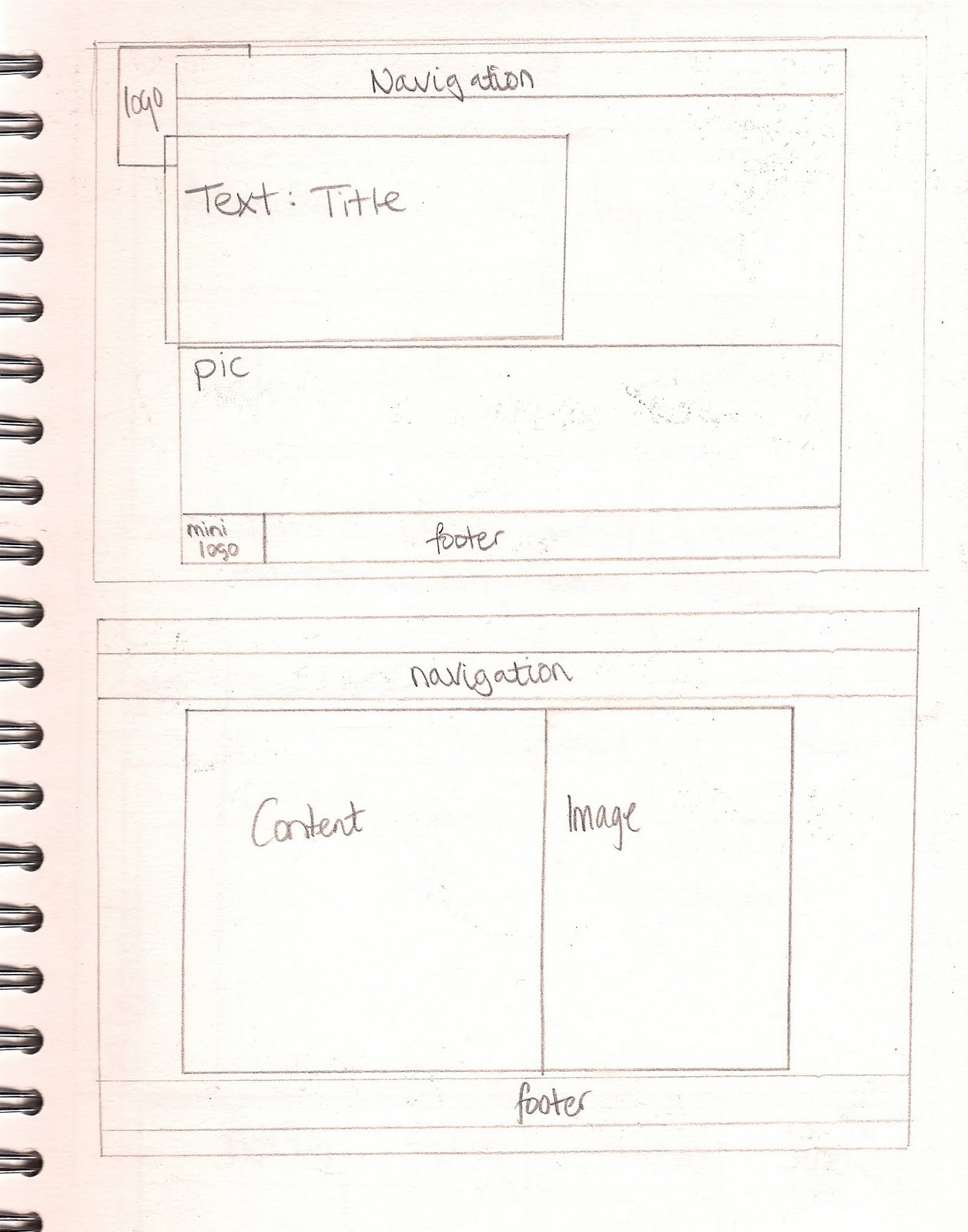
My second idea is to design an anti piracy website for Apple so I can focus on their advertising, marketing and branding. With apple it is always about the people as Apple represents innovation, imagination and a sense of community. By designing a website for Apple it give me a sense of what and why this product is being made. I want to be able to communicate to the audience how digital piracy effects brands that are part of their everyday life and how this effects products that we use. The website will include 4 pages including home, iexperience (about), what is itunes and contact.

On the iexperience page I plan to create 2 instances of what will happen if you choose itunes to download your music from or if you choose to download illegally. Both will be a flash animation.

I was inspired by flash animation of stick men interacting with with interfaces. I want to create a similar effect but with a more sophisticated character. Fir example if you click on the illegal download option something might blow up.

This will show the audience that if you download illegally there will be consequences. Also the 'fun', free movement of the stick men go well with apples creative brand as it won't take away from the content but it will illustrate anti piracy through guiding movements etc.