Wednesday 11 May 2011

Artefact 6 Evaluation

Overall I am very happy with artefact six and the point it has brought me to within the personal research project. Due to the feedback I received from artefact five I feel that creating a ‘web package’ made from an iphone application, ipad application and website will attract a broad range of students. I have made the iphone and ipad application connect with the same scoreboard but for different variations of the game. This will bring a sense of competition to the game and bring students together over facebook as they can share/compare their scores therefore this will advertise the art gallery more.

Another reason why I have created two variations of the game for different reasons is because of the user experience design. The iphones size is restricting therefore it would be difficult for users to recreate pieces of artwork to that scale successfully in the amount of time given. In place of this game on the iphone I have created a question and answer game. By creating these two games I will attract a broad audience made from more logically minded students that will be attracted to finding out more facts as well as students that are more attracted to the creative aspect of the application.

I think that the applications work well together as they all create a sense of what the art gallery is like through its graphics, layout and artwork displayed within the application. As a final artefact the web package incorporates all aspect that new web interfaces has done to change traditional artwork within education. It is a developed interactive web interface that allows students to develop their education and experiment with forms of artwork both traditionally and digitally. Entwining their museum experience with a new web interface gets students more involved with the artwork.

More Artefact 6

Due to the feedback from my last artefact I have created an iphone version of the game with a social networking element to advertise the gallery and give the gamers some one to compete with.

I have done a different game for the iphone due to UX issues. It would be hard for the user to create a drawing of a high quality on such a small scene so I have made an ipad version that could be used by visitors within the art gallery.


Feedback from Artefact 5

This is the main feedback I have used to create artefact 6


I like it. I also agree with sam on the social media approach too.
Some possible developments I would suggest...

Add easy, medium and hard levels to each portrait/image
easy - image is transparent
medium - select parts of image is transparent, the rest blank
hard - blank background only

Maybe a larger iPad version would work better for kids too. Could be attached to the wall for passing kids to play on as art galleries are usually boring for kids.

Win medals rather than extra pens/brushes. Giving them more tools would be a natural development of the game anyway. Start with a pencil only then develop to full colour set of pens, etc. The rewards should be medals for completing each artwork. Gold for 1 - 10 seconds, silver for 11 - 20 seconds, bronze for 21 - 30 seconds finally 30+ seconds 'FAIL!' These times would obviously depend on how complex the artwork was to start with.

With using these medals you would still be able to include the leaderboard. 'John got a Gold medal for completing Fisher Boy in 4.5 seconds. Do you think you could beat his time?' Also you could after collecting x amount of gold medals give them 'youve won a £5 voucher to use at our gallery gift shop'

Overall I think its a brilliant idea that if produced well could spark more than just the 8 - 13 year olds playing on it. Yes, this means that I would be trying to beat Johns time of 4.5 seconds to gain myself enough starts to get a £5 voucher :-)

f you wanted to take this further and put it out there as a proper artistic-kids product I would suggest running two Apps simultaneously, an iPhone App which forces kids to look at the images, but instead of draw what they see, they could answer questions about things like what colours were used, what type of paint, what was in the picture, how old do they think it is etc. And then you could have an iPad/tablet App, which could be downloadable, or just used within the gallery itself for kids to act out the original idea.

Artefact 6

For my final artefact I have decided to make a web package that will include my art/game app as well as information about the Usher Art Gallery, The collection (museum linked to Usher). I think this would be beneficial in a real life situation as all aspects are linked to form the Ushers online identity.

I have included a user interface for the ipad as it will link to the iphone and get rid of any UX issue that effects drawing on the iphone. All of the ideas that I have created in artefact 6 have been developed from the online focus group that I created to get feedback.

The Usher Art Gallery has tarted to create a new online identity that I wanted to carry on through my entire web package. The web page is designed for the user to spend longer gaining knowledge and sharing their art work with each other with the museums community.

You can view the original art work and compare it to the work created through the app to make it more personal.
The iPad design

The navigation is designed to keep within the theme of the website. It uses the same colours with simple, self explanatory heading to keep within the theme of the package.
This is the Usher interface I have designed for the option of 'Play Art Project'. (Art project isn't its final name). The background is designed to give the audience a sense of what the game is about.
Before they start the game thy have to randomly choose which material etc they have to use as part of the challenge and to get the students out of their artistic comfort zones.

Once again I wanted the background to further suggest what the game is about so I have done a gradual fade of the background to replicate what will happen in the game on different levels.
As Always the instructions are always helpful...
On the hard level there is a blank background therefore no guidance of how to recreate the image. The aim of the game is to recreate the art work in the quickest time possible in the materials, colour etc set the idea is that the students will gain a deeper interest of the art work if they recreate it in their own way.
At the Medium level you can only see a faded image.

The Easy level gives you the most guidance as you can see all of the image
The scoreboard will keep the level of competition up. The aim is to reach certain targets of amount of medals won in a certain time to win a voucher for the gallery.


Sunday 1 May 2011


iplots seems like a good way to see if the navigation on a device will work, especially when it comes to designing for new devices. Although it seems to be useful I would only use it when it comes to designing new UI for iphone but I couldn't use it due to the complexity of my navigation as it is a gaming app.

Artefact 5

My aim for Artefact 5 was to create a User Interface for one of their exhibitions. However after looking at their newly designed website, with added information about their growing education section I decided to create an app that can be used for any one of their exhibits. I think that this approach is the best way to go as the app could be adapted to any exhibit that the museum may want to advertise, especially in this time of need (funds).

This is their new website http://www.thecollectionlincoln.org/usher/?page_id=43. The main page that changed the direction for my app is the Saturday workshops that they provide for 8-13 year olds. The children get to use different mediums varying from collage to paint and learn about the art work within the museum. I have created an art app that is based on their workshops on a Saturday, giving them the chance to get more involved with the gallery/ recreating artwork in both traditional and digital methods.

I have focused on how the navigation will work within the art/game app as it is a key part to how the audience will interact with the app.

The first interface is based on the art app artstart that was designed by a teacher as a way of inspiring children with different projects.

My version is basically the same concept but leads on to an art gaming challenge. I have slightly changed the navigation so that the audience can change the sub sections individually. I think changing them individually is a good idea as it will get the students to think about one medium and how it can be used in different ways to challenge their comfort zones.

Unlike art start the version I have created is designed to get the children to recreate the art work in different mediums so that they students can get more involved with the artwork therefore forming a connection with it and the museum. By recreating it they'll want to find out more about it.
Once the colour, medium and artwork has been chosen it will be summarized on a UI with the painting in full that they will then recreate on the next screen.
They have a set time to recreate the artwork. If they complete it in the set amount of time they win an art tool. All art tools won can be used at the end of the game (once they've completed all levels) to create their own artwork that has been inspired by the previous stages of the game.
The UI sums up what art tools they've won. If they choose to they can go onto the information section to learn more about the art work or move on to create they've own piece of art on a blank UI.

Once the levels have been completed the children will have the option to look at the knowledge section or...
Create their own artwork using the tools they've won from the game.

Friday 29 April 2011

User Interface Design (revisited)

I have designed 3 UI's for the iphone. They are all based on a question/answer game using different navigation to see how I can get student of a different ages to engage with UI for learning that they don't see as a task.

This UI uses a simple touch option to select the answer. Simple, easy to use.
This is based on the same question/answer game however I have used a different navigation that gets the audience to interact with the interface a bit more. This is a typical technique used by apple.
I have added a new element into this interface to engage the audience in a simple game- guess the answer to the question before the water level goes down. The quicker the audience does this the more life they keep.
I think that the challenge now is to make sure that the game is suitable for the Usher art gallery.

Art App Development of ideas

I have tried my previous idea with an iphone interface. I am having slight problems with the adjusting to the size of the screen from designing for web, in terms of navigation. I have to be very careful where the navigation is positioned in order not to clutter up the page and ruin the UI as the audience won't be able to see the full UI to see what the game looks like.

Thursday 28 April 2011

Story Boarding for Art Museum App

The idea of this art/game app is to get children more involved with the art work in museums. Through gaming they learn about the pieces of art work through acceding through the levels to win art tools as prizes before they run out of life. The game is quite simple so will attract most ages as they won't see if as a task they have to do.

They gain more points/tools by guessing the answer to the question before the water level is at its lowest point. I still intend to design this based on the Lincolnshire Usher art gallery exhibit.
At the final stage the 'prize' is to create a drawing with the tools that have been won. My aim to to inspire children through this art app to use techniques and expand their ideas through absorbing ideas from masters of the discipline that they have gained knowledge about by playing the game.

App Map

This is a map of how my app will be navigated, what functions it will have and how people will engage with it between each interface....Now for the game plan and design.

Wednesday 27 April 2011

Example pic


This is one of the photos that we are using in the multimedia catalogue for 2011. (sorry Sam your voted as the 'example'). It'd be great if everyone could get the raw file version and the jpg version. Cheers!

Tuesday 26 April 2011

UI IOS Navigation

The iphone is very restrictive, it is very small, doesn't have a keyboards and few buttons so I have to be thoughtful when it comes to navigating such a small screen. It needs a navigation that doesn't clutter up the UI.

Navigation on an iPhone generally allows you to-
  • explore all of the level of the flow diagram and get to where you want to be easily
  • switch between main functionality systems without loosing your place within the app
  • edit and adjust info without loosing your place
  • display a list of info or choices

This is a tableview controller. It uses a tab list that is scrollable. Each option provides another list once tapped. This allows for a clean design that is easy to navigate. Easy to understand as items of a similar nature are generally listed in the same category/section.
This is a tab bar controller. It is designed to save space on the screen once you choose the option to hide the main screen. Each button has a menu that pops out individually that you can hide easily.
This is an example of flattened navigation hierarchy. It is usually used in information rich apps. It works by having a single type of main view with multiple option within each of them.
The 2 app navigational systems below aren't standard navigation systems but they focus around one interaction point. The first app uses a ticker wheel that is designed by weightbot. It has a mechanical spinning wheel for selecting items.
This navigation is used mainly for musicians but is a different version of the tab controller as it is placed in the middle of the screen instead.

User Interface Design Tips


http://www.ambysoft.com/essays/userInterfaceDesign.html

  • User need to know how to work the UI that you designed for them so keep the UI consistant throughout the design.
  • Use a interface flow diagram.
E.g.
The flow diagrams used is to form the architecture of the app and how the user can move through the stages. It can also be used to form the behavior of the user. It gives me the chance as a designer to see if the system of the app will work. The main purpose of the UI flow diagram is to see if the UI is useable.

  • Design the navigation left to right, top-bottom as in western cultures this is the format that we read in. It will seems more natural.
  • Colour should be used appropriately. If you use it as a highlighter make sure that you use something else to highlight it as well as people might be colour blind. Also use it sparingly so as to not overwhelm people.
  • Use the contrast blue e.g blue on white is easy to read, red on blue isn't
  • Align the fields. Left justify so make all the fields line up in a straight line. MAke the other fields right aligned so that it is organised. Make it is visually appealing and efficient.
Constantine and Lockwood have a set of principles that guide UI design
  1. The structure principle. Your design should organize the user interface purposefully, in meaningful and useful ways based on clear, consistent models that are apparent and recognizable to users, putting related things together and separating unrelated things, differentiating dissimilar things and making similar things resemble one another. The structure principle is concerned with your overall user interface architecture.

  2. The simplicity principle. Your design should make simple, common tasks simple to do, communicating clearly and simply in the user’s own language, and providing good shortcuts that are meaningfully related to longer procedures.

  3. The visibility principle. Your design should keep all needed options and materials for a given task visible without distracting the user with extraneous or redundant information. Good designs don’t overwhelm users with too many alternatives or confuse them with unneeded information.

  4. The feedback principle. Your design should keep users informed of actions or interpretations, changes of state or condition, and errors or exceptions that are relevant and of interest to the user through clear, concise, and unambiguous language familiar to users.

  5. The tolerance principle. Your design should be flexible and tolerant, reducing the cost of mistakes and misuse by allowing undoing and redoing, while also preventing errors wherever possible by tolerating varied inputs and sequences and by interpreting all reasonable actions reasonable.

  6. The reuse principle. Your design should reuse internal and external components and behaviors, maintaining consistency with purpose rather than merely arbitrary consistency, thus reducing the need for users to rethink and remember.


Monday 25 April 2011

IOS UI Revisted

http://developer.apple.com/library/ios/#DOCUMENTATION/UserExperience/Conceptual/MobileHIG/AppDesign/AppDesign.html%23//apple_ref/doc/uid/TP40006556-CH19-SW1

I have visited this website at the start of producing the artefacts. It is really helpful as it provides a lot of information about how to create an IOS app. I have gone through the basic structure of how to plan my app in order to see how my plans have developed a few artefacts on.

Potential features users might be interested in:
  • Creating artwork
  • earning points
  • Socialising through earning points (international/local scoreboards)
  • gaining art knowledge
  • throwing paint game
  • exploring different art games
What is most important to the users
  • They are artists
  • want to learn about art in a fun, game experience
3 characteristics that app buyers have
  • Love to experiment with art
  • gain knowledge of art
  • want to experience art in a new way
App definition statement (this is to be referred back to at any time to focus the app)
"An art knowledge tool for creative students that love the gaming experience"

The app should have classic characteristics of IOS apps.
  • IOS users are accustomed to the look and feel of IOS so the buttons have got to feel like they belong to that device.
  • Controls should look tappable
  • App structure should be easy and clear to navigate. IOS provides the navigation bar for drilling down through hierarchical content and tab bar for displaying different peer groups of content/functionality.
User feedback for IOS: should be subtle but clear (an animation for example).

The user expects to accomplish something in an app.

Design for touch- get familiar with UI elements and patterns of IOS. Examine menus, interaction initiated by hovering and links.

If the app is a game or provides an immersive story driven by experience people expect to enter a unique world filled with rich, beautiful graphics and innovative apps.

User Interface Design


I have been exploring the process of User Interface design (UI) and have come across a company that produces UI for a wide range of platforms (android, ipad, iphone, blackberry etc). The company Sourcebits are about creating beautiful, easy to understand UI design. They see the design as being very important because it is what will leave the user with a lasting opinion. They create apps for the web and mobile, making them very flexible.

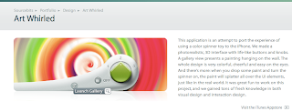
Art whirled is one of their most successful art apps as it provided the audience with a simple, easy to use spinning canvas. It replicates how paint splatters in real life without the mess.
Screen shot of UI
Layout of UI (wire frames): each frame has a wire frame designed with functionality high on the list so it is easy to use
Inspiration for UI
Objects that the paintings created in the app can be transferred to.

What do art galleries need from apps?

I think it is very important that an educational art app gives the user a taste of what the art gallery is like. I think the app should encapsulate what the art gallery has to offer through its graphics, information provided, layout and purpose of the art app.

I am looking into options of creating an art app for The Usher Art Gallery in Lincoln. It is a small art gallery, not unlike The Tate. It does have a large education section http://www.lincolnshire.gov.uk/visiting/museums/the-collection/new-investigate-art-programme-at-the-usher-gallery/ that aims to give students an experimental experience of the art gallery. I want to give the students an experience through the app that they won't get in any classroom to inspire them, spark their imagination.

The Usher Art Gallery also offers an educational program called 'Investigate', which is designed to engage students in 'hands on' activity. I want to replicate this in a user interface design.

The education department holds work shops that cover many areas such as:

For example the Time detective section goes through what detectives do to find out what the art work is about. I could recreate this in an art app that the students could feel like they are just playing a game. In fact they will be learning without knowing it.

Saturday 23 April 2011

The Game Theory Behind Apps

Game Theory: The Basics (http://herselfsai.com/2007/03/game-theory.html)
Game theory is the study of how people make decisions and how people will react during these processes. According to the Nash Equilibrium many of peoples actions can be predicted as it is assumed that they will go for the rational choice. Rational choice is defined by 'the action chosen by a decision maker is at least as good as every other available action'. (Jon Von Neumann). To me this suggests that one action my be preferred over another because it is seen as being benifical to them (e.g. they gain more points by choosing option 'A' over 'B').

Nash Equilibrium is when a player can do no better than one another no matter what the other person decides to do.

iPhone gaming has created a new trend of 'the disposable game'. For instance people like angry birds for its experience without making a commitment to it through its cheap price. It has also changed the way that game are distributed, bringing gaming further into the distribution digitally. Also gaming through the iPhone adds a more socially focused element to gaming through global scoreboards that keep people coming back for more to top the score boards. Apple have landed on a money making scheme through peoples need for social integration. gaming apps fill the market for those of us that will only go on social networking sites before feeling a bit 'stalkerish'. Gaming apps are a perfect opportunity to fill your time and still interact with other on a different level.

Thursday 21 April 2011

The Usher Art Gallery

The direction of my research project has gradually become more focused towards User interfaces. After experimenting with a few art/game app ideas that aren't based on particular exhibits I thought it'd be a good idea to base one on a current art exhibit. I have chosen the Usher Art Gallery in Lincolnshire as in is a small gallery with a growing educational sector. Although the educational development officer was interested, they want to see the product after I have completed the research project.

The pieces of artwork below are from different exhibits within The Usher Art Gallery. I choose these as I think that they represent the art gallery and I want to create a User Interface that encapsulates the atmosphere of the gallery.


Wednesday 13 April 2011

Validation Process

I have validated all of the main pages of the website. It document type is XHTML so it is a bit stricter than standard HTML.

The errors that arose are below.
One of them was that that some browsers don't support the cursor hand but only supports pointer. This just refers to the type of icon used to show that it is a clickable image.
Next error= Z index
The Z index signifies the stack order of an element. This means that the Z index only works when the positions of elements are set to fixed, relative or absolute.
This is one of the problems caused by the tags in the ditto call, connected with the Hpfeatured and HpfeaturedTPL
This means that script language is wrong it should be script type instead
This error is referring to the border "0" being referenced constantly so should be set in the CSS as a div class to create cleaner code.
Result- Homepage validated!
Validating the 'About Us' page

Extra div in the foot section