Wednesday 8 September 2010

Portfolio Choices...

I like this mock for the portfolio page because people can easily click through all of my work but this might become a bit tedious when more work is added. Also I'm not sure if it'll end up looking a bit too cramped if I stick to this layout..
This portfolio mock up might work better because its in a cleaner layout. I would want people to scroll though the content in the same area e.g. the line stay in the same place so it doesn't seem like the audience is scrolling through pages of images.
You would click onto one of the images and go on to an info page about it. There would be an option to see multiple screen shots or go to the live version of the site I have created. I think the flowers flowing through the content are a nice touch to guide the audiences attention.

Portfolio Inspiration

I like this website purely for the introduction and it's outstanding use of illustration. The illustration grabs the audiences attention with simple colours and movement from the first page. The only thing is its navigation, it's hard to find and use as its over powered by the image.
http://www.garethdickey.com/
This site inspired me for its simple layout but it feels very personal because of the image of the guy (that I guess is meant to be Gareth). It stands out because of the good use of yellow and simple navigation. I like the little touches he's put in so you get a sense of what and who he is for example, the Belfast crossed out and his current location put in. Also the simple navigation that lights up when you mouse over.
http://hugsformonsters.com/
This one is my favourite! I love the use of illustration that is used on the front page and guides you through their portfolio without over powering the work. I also like the introduction line, to give the website a personal edge. So you know what the website is about he has got his work on the index page as a preview. I think this shows the audience what talents he has and tells them automatically what it is about. One last thing that strikes me about this site is the bold yet gentle use of colour.
I like the sense of movement as you navigate through each section. Also it has a sense of simplicity as each piece of work has a description next to it. The work is also defined by a pattern in the background to draw your eye towards it without over powering it.

Gaia Logo design

Here are 5 different variations of my Made Like Gaia logo design.

logo 1: Bold colours that I think represent my personality. Plus it will make the logo stand out against the page. Also i have added a bit extra 'decoration' in the form of leaves to represent the meaning of Gaia (earth mother) and to show the 'growth' of my website design etc.
Logo 2: same colours, same leaves but placed differently. Maybe looks too much like an army print though...
logo 3: Simple spotted pattern. I don't think it represents my personality though. Too standard and doesn't stand out against competitors.
Logo 4: Maybe the winner so far. Simple bold colours with a slight texture to represent my brand. I am going to experiment with the texture behind these bold colours.
Logo 5: Stripey patterned paper to represent my home made, creative style.

Tuesday 7 September 2010

Portfolio Mock-ups

So far I've done three mock-ups. I want to create something simple with a clean layout yet shows people my creativity/ skill set automatically.

Mock-up 1
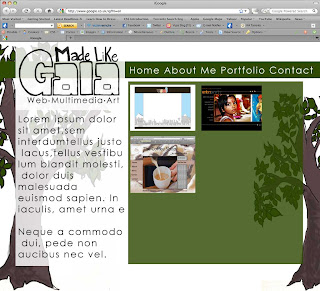
  • I don't like this at all the trees send out the wrong message. The original idea was to have my tools 'growing' out of them but this doesn't suggest website designer to me...
  • I like the position of the logo though. People will instantly see it.
Mock-up 2
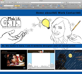
  • I'm getting there... So far I think the different segments for an illustrated header, navigation and a few pieces of selected work compliment each other because the audience automatically get a taster of my website design at the same time as my illustration skills.
  • I don't think the blue works. It separates the page too much.
Mock-up 3
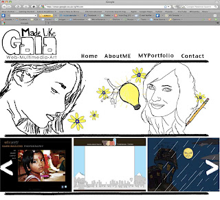
  • So far I like the banner with my illustrations. I chose images that represent me but I may play about with them to introduce text. Maybe make the illustrations change every once in a while to keep the audiences attention??
  • The navigation is easier to see due to the hand drawn line guiding the eye.
  • At the bottom I have done arrows so that the user can navigate through the previews
  • Maybe add more colour into the logo to link it to the illustration?
  • Add text introducing myself in the illustration...

Thursday 2 September 2010

Meaningful Broadband

In today's world the importance of broadband connection is increasing, perhaps to the stage where it is being compared to the basic need of food and water! The UN is trying to achieve access to broadband in an affordable manner. Dr Hamadoun Toure, secretary general of the International Telecommunications Union told the BBC that education, fighting disease and gender equality are all pressing issues that they are aiming to resolve by 2015 and that technology is a prime tool of achieving this goal. Dr Toure believes that broadband is a communication tool that can accelerate the progress of the developing world.

"I am putting ICT [Information and Communication Technologies] as an opportunity of meeting the goals."

He sees this as an opportunity to use technology to develop e-education and e-health programs. This rises the question of how the world can afford when they are struggling to afford water and basic health care. Is the western world becoming obsessed with communication through the internet? Do we take it for granted? If one thing is clear it has changed our priorities in the western world.

Wednesday 1 September 2010

Portfolio Logo Design

  • First logo-hand written text not clear enough
  • Edges of text needs clearing up
  • Maybe a pattern behind the 'Gaia' text

Made Like Gaia...

It's time to get back to work! After moving about a lot over the summer and finally getting a decent Internet connection (don't get an 02 dongle) I have got updates on my portfolio website.

My concept is made like Gaia. Gaia is the original spelling of my name and is the earth Mother. Although through my designs I'm not recreating something as big as nature itself I put a lot of love and care into my passion of website design and illustration. I want my portfolio to be a brand of what I see myself as- a designer with many unique skills and qualities. I am not just a website designer. I code my own site in many languages, I am the graphic designer, fine artist, illustrator etc. I want my portfolio to portray a sense of growth as both a brand and as a designer so below are a few starting points...

I had the idea that my logo and be part of a tree to represent the growth of my brand with my tools 'growing' out of it

Initial ideas for a logo. Simple text, maybe experiment with patterns behind the text?


Portfolio Update

More Wireframes...