Tuesday 29 December 2009

My Three Top Influential Designers/Artists

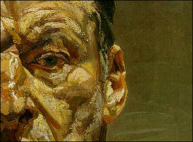
I am finding just choosing 3 artists/designers that influence me very hard. There's far too many to choose from! It got me looking at work from Escher, Cindy Sherman, Cosmin Bumbut, Xio Xin, and David Carson to name but a few. It has got me thinking about what areas of design interest me the most and how researching other designers practice is involved in my design process. I have always had a love of portraiture as you can see from my first two artists Lucian Freud, for his beautifully textured expressive paintings. His subjects are often in awkward positions or commencing situations that give his paintings a highly personal viewpoint of the relationships he has with his subjects. My second choice is Sonya Suhariyan who uses traditional tools to create her ideas of the female form that merge the commercial world with fine art. My final choice is Saul Bass for his clear cut, simple use of shape and colour.

Although there are many digital artists that also influence me I find that starting with traditional forms of artwork make my design process more unique so that I can blend the new with the old.

Lucian Freud, painter
I have loved Lucian Freuds work for many years as his work oozes passion and expression with big texturised brush marks. He appeals to me through the intensity that the colours, tones etc create that bring the character to real life. I also like the fact that he doesn't glamourise his subject. When you look at his painting you get a sense of 'real life' and not something commercially fabricated. In terms of influencing my work as a multimedia practitioner I want to take on board and not forget my love of painting. In all of my work I like to bring in some form of traditional media with all the technology driven tools I am using. Also refering back to his work reminds me that pen and paper are always a good starting point whilst designer. It isn't about how many new technologies I use it is about how I use them to compliment eachother.
Sonya Suchariyan, Illustrator
Although I have only recently discovered this new Russian illustrators work. I like the way she using multi disciplines to illustrate her work. She uses photograhy and various forms of painting and drawing to influence modern music and fashion culture. She appeals to me because of her vivid but careful use of colour, her eye for line and detail and suttle messages she communicates trhough her work. A good thing to remember from looking at her practice in relation to mine is that I can use illustration to add content and diversity to my websites whether it be hand drawn or didgitally done.

Saul Bass, Graphics designer
Saul Bass is an all round master. He uses simplistic shapes, block colour to grab peoples attention to the message and create classic logo design that introduced a new way of poster design in that era. I think the piece below works well because the simplistic shapes let you know quickly and effectively what the film is about. By doing this is attracts more people as he doesn't over complicate his design so people are put off. He brought movie credits out of the darkness and brought it into being an integral part of the movie. This is a value that I want to take on board to bring my website design together. Some websites I design I will have to incorporate a lot of information that people will have to browse though but I intend to use graphics, illustrations, films and all round good design to absorb peoples attention.

Tuesday 22 December 2009

Hand drawn animation


2 hand drawn animation that caught my eye on youtube. I like their 'free' style of expression. The traditional drawings remind me of childhood cartoons.

Monday 21 December 2009

'Waterfall' vs 'Whirlpool' Software Development Models

The waterfall software development model is the simplest of it's type as it states that the design and creation process of a website can be of a linear order. The order is very strict
e.g. once the analysis is done only then can the requirements specification be done, then once the requirements specification is done then the design can begin and so on.

Through following the waterfall so strictly it can lead to a project being completed within its time limit every time. However it does have it downfalls. The waterfall allows you to establish a solution early by effectively freezing off each section before starting another. However this creates a problem when system requirements, user needs or design purpose change as you can't go back a stage to change the design. The waterfall can lead to the ultimate disaster- the system might become irrelevant.

To make the waterfall work for you you need highly skilled designers that are gifted with foresight to enhance the system but it will reach a point when it won't be able to be enhanced any longer. In my opinion the waterfall would be better suited to building a structure because it will have clearer objectives and and relatively stable architecture whereas the purpose of a website could change instantaneously.

(puffin,2009)

In comparison the whirlpool is better design as it keeps in mind that the system requirements may change without warning so it focuses on a select few, important set of requirements in order to provide a basis for the project. The riskiest and most convenient hurdles are tackled first so that it can be predicted whether the project will become to expensive or threatening. This leads to more stable structures.

The most useful part of this model is that it allows you to work on more than one section at once, such as design and analysing or coding and maintenance.


(puffin,2009)
The whirlpool can be a useful strategy when it comes to website design because it allows you to come back to areas of the design process to make modification whereas the waterfall will only allow you time to go through once.

Thursday 10 December 2009

The troublesome navigation code

The final out come I created my creating new divs on each page so I could lay the website out appropriately because not every page was exactly the same due to the JAvaScript game and photo gallery .

Boxes were clashing with eachother...


Complications

Today while I was trying to validate my website I came across numerous complications. My website function and looks like I want it to but I have over complicated the CSS coding.
I have done 2 websites in CSS overall to try to combat the navigation throwing the rest of my navigation off course. I found a solution but have made far too many div ids so it has become overcomplicated to manage the code. Also all of the JavaScript is working up to standard so the only problem has been that I have been placing the div id's next to each other and not all of them are within a box so knock each other out of the page.
E.G.


Validation


27 errors to go. Validating time!

My design process

My wire frame. Clear and simple. It allowed me to sketch out idea and go through what what work best for the websites purpose. To draw in peoples attention through interactive navigation.


Where do people look whilst they scroll through a web page? How long to you have as a designer to catch their attention? These are all thoughts I played with whilst I designed my lay out. I designed the navigation to follow where people are naturally attracted to on websites.
Tasty banners. What colours make people hungry? Get them interested in the product? Yet works in a simple way.

From looking at studies I can see that people pay the most attention to the left hand corner and scroll the page in a 'F' shape. For my 1st site I think it is a good idea to look at the ways people develop an understanding of the site in a few seconds.


Wednesday 9 December 2009

My first website

Here are 2 screen shots to give you a general idea of what that CoffeeShop website is like. I'm really happy with the outcome so far enough though it has been a painful process. I've asked a few people to look at the website and they all find it easy to use. The colour and textures of the site make them hungary as well. I just need to validate it.

The hardest part was the navigation which ideally I would've liked to be animated but thats another challenge for another project, maybe flash?