Monday 30 March 2009

Changing Ideas

After my review I realised I was making my ideas too complicated for the time scale that I have to work with so to support my idea of people around you changing/adding to my identity I have created an interview situation. It is basically a question and answer game where you choose the picture and comment of a person who you think is most valid to my identity. 
For example a comment like "Gayr's first memory is..." might add more to my identity than "Gayr lives in Nottingham." The aim of the game is to reach the end of the game and get as many clues about me as possible.


Initial sketches

Images I will use but I need to add text in flash. Each person in the game I know well so it will show how they have influenced me as a person.

Sunday 22 March 2009

Avatar developments

So far so good with my avatar although it is taking a lot longer than I originally thought the shape and form of my avatar is going well. I have been concentrating on the female figure, which has been difficult to make realistic because I have had to get rid of a lot of geography so the breasts don't look lumpy. They still need a little work but they are on their way.  I found the clothes quite easy to model. I'm just looking forward to adding texture/ colour etc to bring her to life.


Thursday 19 March 2009

Curiosity Box Experimentation

I was having trouble getting to grips with how I'd use layers to create my introduction. I want there to be 3/4 photographs of myself presented in flash and the audience has to choose the image different sections of the face (like the exquisite corpse.) A third year student (thanks to Simon) helped me to organise the frames with a bit of action script.


At first Simon suggested creating a sub menu to choose different heads but I felt that this would compromise my ideas as I just want the audience to click on the face and it will change.
For example you would choose the top of the head that you want, the eyes the neck. This would all be a symbol of how others change you identity, as a society we effect each other. Would we all be who we are today if it isn't for you family, your friends, or that person you bumped into in the street?
(original idea)

Click on the head

Then it be change to the next head. If you like that one you keep it and move onto the eyes and repeat the process so that you make my appearance resemble what you think my identity might be by first impressions. The image of my face on one level will symbolise what people think of me on first impressions, the next level will go into my pixilation, avatar, flash game etc

Monday 16 March 2009

The future of interaction design

Everyday we're used to interacting with different interfaces but what if the interface becomes part of you? While I was researching Marius Watz (a generative artist/graphic designer) for my essay I came across this tattoo interface. Her phone is ringing but there is no visual phone going so what does she do? She answers the phone with by pressing a button embedded in her skin's surface and while she's talking the tattoo comes to life as a digital video of her caller. When she finishes the tattoo disappears. 

Are we already at that stage where people are willing to let technology mark them, to mark their identities with technology in the name of communication?

Thursday 12 March 2009

Progress so far

I feel my project is developing all of the time even though time is quickly running out. At the moment it is at the following stages:
1) AV element: I definitely don't want to take the audio visual specialism route so I am in the process of creating a pixilation. I have got the basic visuals and just need to add the music but as you can see form my last post I might be adding more to the story.
2) Logo: Done a small survey of want logo people are attracted to see if it stands out as a form of advertising. Fully designed on paper. Now in the Process of altering in photoshop. Depending on time and outcome I might alter it in 3d max.
3) Avatar: Altering in 3d max. Experimenting with female figure as strong part of my identity. Need to create clothes, hair and most importantly the facial features. Still need to think about how the avatar and hand (still need to make) will work together and if the hand is a strong enough image to symbolise how the government/money/politics/society help to mold our identities. Probably going to add text to explain its story. In the process of creating avatar.
4) Idea is finalised to create pirates map for the route my travelling experiences took and by following this map in a game people will find out what elements of that trip made me who I am today. Still doing tutorials to grasp techniques I need in flash, about to start it in flash but will probably leave it until the avatar is on its way as I don't have 3d max at home.
5) I am going to create a digital comic to express morals that I believe in and that were put upon me as a child to express how my identity is the was it is through my conscious and believes. Still sketching the comic picture to play with in photoshop and export to flash. Another idea is to create a flash based website to test my more information based use of website design and whether online environments is for me.

So far I think that my ideas are all strong but I need to work on the final element. At the moment the tutorials for flash and 3d max are really helping me work out how to do my ideas.

Lego Men- The dark night!

Evil Character (for my Pixilation)

http://tomztoys.blogspot.com/2008_01_01archive.html
Check out this amazing version of a trailer for the dark knight all done with Lego men. It's put a new light on my Lego man pixilation. So far in my pixilation I think it's gone off to a really good start but it needs more of a story. I think the answer to this is a more obvious villain. Before the villain was a bird flying in and taking them away to symbolising the loss of people throughout my life and how important family and friends are to me. However I think that villain should take a face and maybe it could look like a trailer to a 'film' rather than a short narrative. The narrative of my pixilation is that life is part of death. Although it seems like a distant part of my identity it has become a very important one to me in the last few years since loosing family to death. It has helped me become who I am today through remembering the influence that that person had on my life. I want to represent it in a film trailer style way because it is one of those things that you think will only happen in films never to you. Also I can dramatise certain aspects of it through the introductory text, fading/ merging scenes from day to night ect...

Tuesday 10 March 2009

Flash Tutorials

Check this website out for flash tutorials: http://flashfridge.com/tuitorial.asp?ID=118


This is a simple animated photograph that I used twice to experiment with how I could introduce my box of characters. The blurred effect was easy to do but probably a bit too simple for what I want my overall box to look like however it is helping me get used to flash cs3 and its potential. I am going to do a few more tutorial on creating flash games before I get stuck into my final products.

Again this tutorial deals with another form of animation in flash that I wanted to experiment with. Although it is simple at the moment I could take this onto another level by not just taking away her face, her identity but replacing it with another. 

Monday 9 March 2009

Oh by the way if you have comments on my ideas let me know what you think...

Updating ideas


I was really inspired after jool's lecture last tuesday when he was talking about bringing different issues of society (the recession etc) into your essay. It got me thinking about what part I play in this and what ways I contibute to the recession in teh future. As a designer it will bring me challenges such as budget, energy etc. My main thouht was how we are all controlled by money and teh government. If our money lessens we start panicking. Most people in this world are judged by the items they own therefore how much money they have. This is where the avatar hand comes in to represent us loosing control, being grabbed by forces outside of our control. I thought the hand could grab my avatar as part of my animation? Maybe the teh avatar fighting back? 

My avatar. She may seem simple but I choose the simple hoody because so many people can associate themselves with it. Also it makes my facial features stand out therefore showing that the eyes, our view and understanding of the world is more important than what we own. And of course (on an aesthetic level) i put my favourite grey jeans into the design.


I have developed the idea of my travelling flash game. I want to make it into a pirates map where you pick up clues such as personal mind maps, photos, ethnic object etc to get an idea of my identity,


These are my final designs I am going to work with for my logo. At the moment the sunshine logo is my favourite not just because it is aesthetically pleasing but because I think the shape and text represent my personality. I choose curvy, flowing text because I see myself as a flowing person. I didn't mean for the background shape to look like a sun at first. It is just the shape i see myself as a continuous, flowing shape with the up and downs of the rays.


I also like this design but it isn't as aesthetically pleasing as I had hoped. I thought the person was a good idea as it would seem like i was introducing the name of my company...

I have asked some people which design they have prefered so far the sun and flowing text is the clear favourite.

3D Max Experimentation

I found recreating the figure a lot easier this time but I have been working on making it a lot more detailed. I want the figure to look feminine and resemble my figure. My first go above looks rubbish. I thought it might be easier to extrude the area and then bevel it but it looked more like another shape slapped on top of it rather than natural curves. so I tried....

Altering the vertexes to make a breast but they didn't look much better. They just look like little lumps.

I ended up moving onto the shape of the bum. It looked a lot better but it was too curved and in your face. It doesn't look right because my avatar will be wearing a hoody that will cover some of that detail.

Plus there was little lumps that I am going to have to even out. I have made the thigh area slightly more curvy as well to make it feminine.

I am going to spend a lot of time making it look feminine because I think it is an important part of my individuality and it will look even more striking because the avatar will be wearing a black/ green hoody and jeans so that a lot of people can identity with the avatar. Also the plain clothes will make the eyes, hair etc stand out more to send people a subtle message.

Friday 6 March 2009

Pirates of the Floatin' Internet

This is a simple question and answer treasure map. i found it a bit boring but it has some good basics that I think could be easily achievable in flash. I want to design a basic map such as this that will lead to different treasures along the way. It is a game based on cultural experiences and things that I have found out about myself whilst I was travelling around the world. You will follow a map and along it it will give you clues and choices that you will follow to the next country. The aim of the game is to pick up as many clues as possible to get the treasure and find out your identity and destiny...  I want to up the complexity of my game and add in animation and more diverse outcomes to where you end up in the game.

http://rochedalss.eq.edu.au/fish4.htmt
I liked the idea of getting a pirate name. It gave the game a sense of character and imagination. It is a form of your identity outside of the physical you. I think this really appeals to kids to get them wondering what their character will do next.

Unholy Island (Pirate Game)
http://www.fncgames.com/tag/pirates

This is a flash game where the aim of the game is to protect the treasure and make sure you reach it before the live pirates get it. (You are a cursed skeleton pirate.) This is both an action and strategy game. You reach this choice by choosing either a sword or a cannon of which the sword is more manual. 


Thursday 5 March 2009

Character Reactions


I have created this character collage to show how different characters react in different situations. I choose Kim Possible, Pocahontas, Fiona and Violet Incredible to represent different characteristics I can relate to that might add to the features of my avatar. 

Kim Possible: this was one of my favourite cartoons that I felt that I could relate to as I grew up because of her feisty personality and I also thought it was cool that her side kick was male. I liked the way it's message was that woman can be just as strong as men. Also they guided each other in situations which added to her caring character. The 3 images of her show that she is just a normal girl (brushing her hair,) but anything can happen to her. She can even fight villains and turn into a horse.
Violet Impossible: Violet called out to me simply because every woman has been as her difficult teenage stage. Hiding who they really are and 'flowering' into the person they are in today's world. That is her process in the film, growing from an uncomfortable teen to a strong young woman.
Pocahontas: she is my favourite Disney character because of her charm, her strength and her need to explore. I think Glen Keane animated subtly by broadening the stokes defining her gradually to show strength. She also shows delicate emotions when she and John need to come to terms with their sharp cultural differences. I am in amazed of how her emotion reflect what is going on in the world around her. I think that is a vital part successful multimedia designs.
Fiona: My favourite part of this character is that she is so different form the other heroine. she isn't waiting for the perfect princess that is so typical of fairy tales. She just stumbles upon shrek in his, lets face it ugly state. She falls for his personality and because of this is strong minded. Even though she is in love she is shown (in the above pictures) to be in control of this. She knows her own mind yet has a loving, caring, reflective side. 

Now that I have looked more closely at character reactions and how they build the character I think this will help me to develop my avatar into a more well rounded character. I think lately my design has been quite flat as I wasn't thinking about how they react to other people/situations and environments. I think all of this will help contribute to a character that better describes my identity.

Tuesday 3 March 2009

How objects say who you are....

This is a composition of how objects express who I am by bringing back memories, my flaws, who is important to me and what places I hold close to my heart. I choose a  family holiday photo (on holiday) when I was little but I have only used part of the photo. I chose to use the water as it was when my Grandad taught me how to swim. My flaws are represented by the broken shell necklace because it was an object I bought when I was travelling last year. To me that necklace reminds me about how I learnt about who I really am through experiencing life on my own 2 feet. The paint brush and paint are very important to be because they have been objects that I have enjoyed using to express my self ever since I can remember. I put in a life drawing to connect my passion to the community that we life in as that is part of my identity therefore life drawing is an observation of that identity. 

Monday 2 March 2009

Logo Inspiration

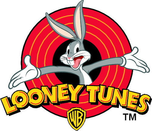
Whilst I have been exploring logo and coming up with ideas (see previous post) I have come across these three logo. The looney toons logo has stood out the most to me because of its vivid colour range and composition. The composition has been the most help to me as I am developing a logo for my box that has my 'company' in bold text with a female character popping out of it. In my opinion the arms presenting Looney Toons makes the title stand out because bugs bunny becomes the center of attention so you know what it is about therefore you associate Looney Toones with comical comedy/fun. Also only 5 colour in a similar tonal range are used to keep it simple and not over complicate the design.

Everyone recognises this Logo. It has helped make Starbucks what it is today. Although i am not a fan of Starbucks the logo is very well designed. The two colour work well together to express a 'natural' (green) and serious (black) theme. To add to the natural theme a woman is the centre of the logo to promote Starbucks 'caring' nature.  It also implies that if you buy coffee from Starbucks you are buying the best due to the crown on top of the woman's head and of course it has America written all over it because of the Stars (especially on the crown.) 
Until today I have never heard of Kidlink but its logo has stood out to me because of it simple, linear design that advertises a bold, trustworthy company because of the combination of the structured text and the smiling faces. There is also a sense of 'togetherness' because of the interlinking faces which adds to the sense of people being able to bond with the company.

From looking at all of these logos I think I am going to work on my company/person logo. I am going to experiment with colour to provoke emotion, line to simplify the design and give it structure, text/font to express the friendliness of my personality and the gestures of the person I have drawn to provoke emotion in my audience.