Sunday, 6 March 2011

Inspiring drawing apps

I have been researching art apps for inspiration as to what the art app market is missing. So far I have found a web based app called posemaniacs. It is based on life drawing classes and gives you a certain amount of time to draw the pose. It is designed to make you sketch with minimal lines in the smallest amount of time to recreate the human form.

My idea: I think that this idea could be improved on to develop students skills of drawing from memory. An app could be created that shows them an object that they have to draw, using their fingertips. This could improve on their drawing skills with their fingertips therefore improving the ipad etc as a drawing medium. As the levels go on the complexity of the object that they would have to draw would grow.

To begin with I thought the concept behind this app was a really good idea to train students in drawing with their fingertip. My thought was if they are creative then surely they've got the skills to draw something reasonably good? Well the precision of the tools is awful, the line doesn't follow your fingertip at all so how can this train students. You need a bit of control to be able to draw successfully. There is only 2 brushes that aren't the shape that a regular brush is. It gives you the choice of a square or a circle so you can't make any detailed marks.

On the other hand the functionality is good. It is easy to navigate. Also it times you, as well as marking your precision, which if the tools were of a good quality to use then would be a good way to develop students skills.

My idea: Keep the timing and marking system but with more options of tools and materials to draw on. Also a higher quality of tools that can create more detailed marks.

Saturday, 5 March 2011

Adobe Air as a Android App building Platform

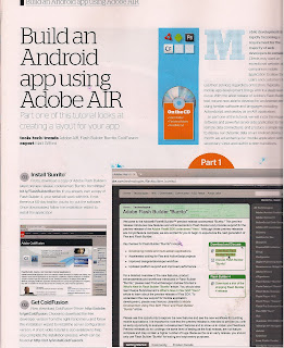
Adobe air runs HTML, Javascript, Adobe flash software and AS3 without the constraints of a browser. This means more experimentation for the app designer. It supports android (what I want to design for), blackberry and IOS.

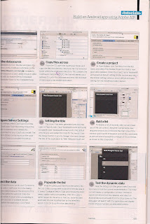
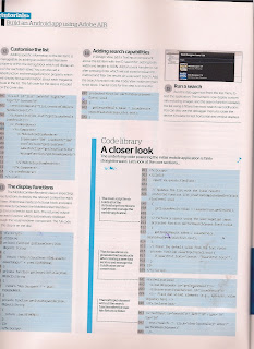
I found this helpful article in Web designer magazine that focuses on creating layouts for apps. I found it really useful as it goes through the code in detail of how to generate search capabilities, which may be helpful for art education based art apps. Within Adobe air you can create a 'project skeleton', where you can define basic for the mobile app layout. Adobe air also has a device simulator to test horizontal and vertical displays.


Friday, 4 March 2011

Sample pages

Now that Tracy (my client) from Wish upon a star has chosen a final design for the home page I am now working on a few templates to follow for the rest of the pages. (See below).

Also it has been finalised what the section are going to be for the navigation. The three photo image titles for the Home page will be Latest Wishes, Fundraising and Lapland.

The drop down lists for each of these will be (but could change once we start to see the layout)

About Us

- The Team

- Press/Media

- How It All Began

- Contact Us

Wishes

- Latest Wishes (I would like this to lead to other wishes granted but we can chat about the best way)

- Lapland( I would like this to lead to the 4 flights, again we can discuss how)

- Centre Parcs

- Apply For A Wish

Events

- Events In Your Area – (Map to be Discussed)

- East Midlands/Head Office

- Northwest

- Lincolnshire/Yorkshire

- Scotland

Get Involved ( These have not been decided yet but here is an idea)

- Community Fundraising

o What on

o Organise an Event

o A-Z Community Fundraising

- Corporate Funraising

o How can you get involved

o Charity of the Year

o A-Z Corporate Fundraising

Donate Now

- Ways to Donate

- Gift Aid


IPad sketches

Both of these videos intrigued me as to how the art apps are used as a medium. They are good footage to see how the painting in gradually developed. What caught my attention is the fact that Mik Godley prefers to use his finger tips than a stylus. Does this mean that we, as artists are being too critical of the ipad as a medium. Instead of comparing painting with your fingers on the ipad to the products that we produce through pen and paper shouldn't we be focusing on it as a new exciting medium. A medium that can develop the realms of art in it's own way.

Also by watching the interaction in the 'Batman' video it has got me thinking about the placement of the navigation for the user interface design of my app.


Combing Art and Game

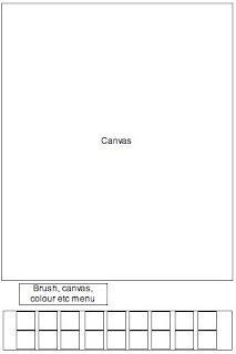
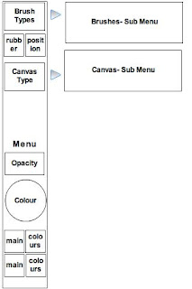
Wire frame 1: This is a simple art app that presents all of the elements to create art work with in the main canvas. Although there won't be as many formal elements to choose from this would be an easy to use app that is quick to use for ideas.
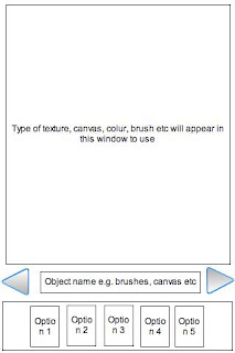
Wire frame 2: I have been studying what tools are included on art apps and none of them have a clear section for canvas types. I think that this is a very important aspect as it replicates what we do when we create physical artwork. One of our first thoughts as artists is what canvas we are going to use and what medium is going to be used on it. Inevitably this effects what the texture of the medium will turn out like. Art apps are lacking in this department, artists are looking for a product that is easy to use yet doesn't loose qualities that working in a physical medium would give you.

Throughout this wire frame I was focusing on how the formal elements options are presented.

Wire frame 3: This is a simple art app but I have focused on the menu as a scroll tool to the left and right so that the audience can interact with the tools easily rather than searching through a lot menus they have instant access to it on the user interface. The simplicity of this design would give artists a place to quickly sketch ideas and send them on quickly. I think that an older range of artists would be more attracted to this rather than art students (around 18yrs old).
Wire frame 4: This idea has taken a new turn away from a pure art app. Going back to my feedback from Ashfield School. I want to combine art and game as an app to attract young artists. I have based this layout on Angry Birds, as it was a very popular game amongst the students that they were easily addicted to. They said that they liked the simplicity of the aim of the game to aim the birds.

I think an art/game app could replicate this by introducing a canvas with a picture on that you have to recreate by slingshotting the paint. However before this the audience would have to choose the formal elements through the menu on the left hand side. I think that the students would keep more engaged with this than a pure art app. It would also introduce them to using the formal elements in a different way, in a form that they can connect to.

Additionally, I have created this art/game app in a horizontal format so that there is a bigger space to play about with in terms of the audience being able to control where the paint goes.

Wednesday, 2 March 2011

Professional coding

Although HMTL mark-up is one of the basics of website design I have decided to go back to basics to an extend to make sure that my coding is industry standard. After an ex student came in to talk about placement opportunities it got me thinking about how potential employers are going to analyze every part of how I create and design websites and the coding has to be understood by multiple people within an agency. So here goes I'm starting to build my website for wish upon a star in dreamweaver. I am also going to experiment with aspects of HTML 5 and CSS3 to show potential employers that I am at the fore front of design.

Also this link established some of the naming conventions (most I already new) but alwauys good to check for that job!


Tuesday, 1 March 2011

What the client really wants and how to find out

Recently I have been talking to Chris Fickling, of ibrow media. Whilst dealing with the client I have learnt a lot of new skills that have helped me to demonstrate the role and responsibilities that a multimedia practitioner should provide. For instance Chris recommended that every-time I have a new client, providing them with a questionnaire that covers the area that the clients needs changing/developing of the website. It will also be solid evidence of cost and a reference point of which to go back to if the client looses sight of what they want. I have re-designed the questionnaire so that the client can focus on areas that they may not have covered previously.

Basic information
  • Who is the key client of the business organisation?
  • Name
  • Title
  • Contact details
Who has the final say of the product?
When is the product needed by?
What may effect the schedule? (e.g. meetings, marketing, reports).
Budget?

Current website
What are the main features you need changing?
What areas are successful? Why?
What aspects of branding, feel of the website needs to be kept?

Reasons for redesign
What are the main reasons that you need the website redesigned for? e.g. outdated website, re-branding etc
What are the main purposes of the website redesign? donations, increased sales, advertisement
What do you want to be achieved in the long and short term of the website?
How will the new redesigned websites success be managed? Questionnaire, google analytics
How do you intend to achieve your business strategy both online and off line?

Audience
Who are you aiming for? Age, job, income, what do they use for the web for?
What is the main action the audience will engage with on your website?
What are the main reasons you stand out from the competition and people choose your website over others?

The impression
Use a few adjectives to describe how you wan the visitor to feel when they are on your website. e.g. friendly, business orientated, professional, cutting edge
How does your website/business stand out against the competition?
Example of URL that you admire

Content
Is there any part of the website that you want to transfer into the new one?
How do you want the functionality and navigation be altered?

Tech
Do you need a content management system to create update able content?
Do you need more defined programming, such as photo galleries, news updates, news letters etc?

All of these questions aim to get a solid idea of what the client NEEDS


The next stage...

Since Wish upon a star have chosen a final design I am building the website and designing the template for the key pages. I am going to create two templates that the website is going to be based on and work with them in Modx (the content management system). So far I have done the wireframes below in Gliffy.


I have also been inspired by http://wisergirls.org/. The website has a beautiful yet simple logo that when you mouse over it, it lights up and birds fly. I think that this may be a good idea for the donation button. When people mouse over the text lights up and the hot air comes out of the balloon or maybe the little girl starts waving.

What to consider with UI design

Android UI Design Tips
Through viewing this presentation it has got me thinking about what makes an app good? It is all about quick and simple functions. If detailed instructions are needed then the app is too complicated so quick actions are needed, such as being able to choose a brush, colour or texture to work with. I have got to think about:
  • How to make the action quick to summon
  • How is my app different?
My aim is still to experiment with merging art app design with game however for artefact three I intend to design a UI and compare it to the rest of the market to see if the audience respond well to it.

About Modx

For my client project I am going to learn how to use Modx, an open source content management system. It is a php and MySQL database. It works by uploading HTML files in to the system that then allows you to create up-datable content with small tweaks.

Here are 3 examples of websites created in Modx. I have chosen them to look at their structure based on the layout of my website for Wish upon a Star and to see if my layout is achievable within Modx.
http://www.ywamthai.org/: I can play about with bold headers and placement of navigation.
http://true-word.org/: shows that the background can be altered to any degree as wish upon a stars will need to be.
http://www.oprone.com/oproneBeta/index.php: use of animated 'news ticker'. I really like how this website is built and the main focus is the news ticker as it will be on my home page. I like the subtle animation that flicks through the news. The timing of it is also good as it gives the audience enough time to look at the content without boring them.

Here is a video that explains the benefits of Modx and how it makes content easy to create and alter without any bounderies.