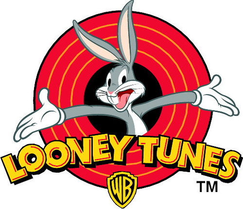
 Whilst I have been exploring logo and coming up with ideas (see previous post) I have come across these three logo. The looney toons logo has stood out the most to me because of its vivid colour range and composition. The composition has been the most help to me as I am developing a logo for my box that has my 'company' in bold text with a female character popping out of it. In my opinion the arms presenting Looney Toons makes the title stand out because bugs bunny becomes the center of attention so you know what it is about therefore you associate Looney Toones with comical comedy/fun. Also only 5 colour in a similar tonal range are used to keep it simple and not over complicate the design.
From looking at all of these logos I think I am going to work on my company/person logo. I am going to experiment with colour to provoke emotion, line to simplify the design and give it structure, text/font to express the friendliness of my personality and the gestures of the person I have drawn to provoke emotion in my audience.
No comments:
Post a Comment