Showing posts with label logo design. Show all posts

Wednesday, 8 September 2010

Gaia Logo design

Here are 5 different variations of my Made Like Gaia logo design.

logo 1: Bold colours that I think represent my personality. Plus it will make the logo stand out against the page. Also i have added a bit extra 'decoration' in the form of leaves to represent the meaning of Gaia (earth mother) and to show the 'growth' of my website design etc.
Logo 2: same colours, same leaves but placed differently. Maybe looks too much like an army print though...
logo 3: Simple spotted pattern. I don't think it represents my personality though. Too standard and doesn't stand out against competitors.
Logo 4: Maybe the winner so far. Simple bold colours with a slight texture to represent my brand. I am going to experiment with the texture behind these bold colours.
Logo 5: Stripey patterned paper to represent my home made, creative style.

Monday, 9 March 2009

Updating ideas


I was really inspired after jool's lecture last tuesday when he was talking about bringing different issues of society (the recession etc) into your essay. It got me thinking about what part I play in this and what ways I contibute to the recession in teh future. As a designer it will bring me challenges such as budget, energy etc. My main thouht was how we are all controlled by money and teh government. If our money lessens we start panicking. Most people in this world are judged by the items they own therefore how much money they have. This is where the avatar hand comes in to represent us loosing control, being grabbed by forces outside of our control. I thought the hand could grab my avatar as part of my animation? Maybe the teh avatar fighting back? 

My avatar. She may seem simple but I choose the simple hoody because so many people can associate themselves with it. Also it makes my facial features stand out therefore showing that the eyes, our view and understanding of the world is more important than what we own. And of course (on an aesthetic level) i put my favourite grey jeans into the design.


I have developed the idea of my travelling flash game. I want to make it into a pirates map where you pick up clues such as personal mind maps, photos, ethnic object etc to get an idea of my identity,


These are my final designs I am going to work with for my logo. At the moment the sunshine logo is my favourite not just because it is aesthetically pleasing but because I think the shape and text represent my personality. I choose curvy, flowing text because I see myself as a flowing person. I didn't mean for the background shape to look like a sun at first. It is just the shape i see myself as a continuous, flowing shape with the up and downs of the rays.


I also like this design but it isn't as aesthetically pleasing as I had hoped. I thought the person was a good idea as it would seem like i was introducing the name of my company...

I have asked some people which design they have prefered so far the sun and flowing text is the clear favourite.

Monday, 2 March 2009

Logo Inspiration

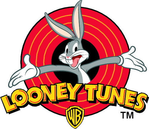
Whilst I have been exploring logo and coming up with ideas (see previous post) I have come across these three logo. The looney toons logo has stood out the most to me because of its vivid colour range and composition. The composition has been the most help to me as I am developing a logo for my box that has my 'company' in bold text with a female character popping out of it. In my opinion the arms presenting Looney Toons makes the title stand out because bugs bunny becomes the center of attention so you know what it is about therefore you associate Looney Toones with comical comedy/fun. Also only 5 colour in a similar tonal range are used to keep it simple and not over complicate the design.

Everyone recognises this Logo. It has helped make Starbucks what it is today. Although i am not a fan of Starbucks the logo is very well designed. The two colour work well together to express a 'natural' (green) and serious (black) theme. To add to the natural theme a woman is the centre of the logo to promote Starbucks 'caring' nature.  It also implies that if you buy coffee from Starbucks you are buying the best due to the crown on top of the woman's head and of course it has America written all over it because of the Stars (especially on the crown.) 
Until today I have never heard of Kidlink but its logo has stood out to me because of it simple, linear design that advertises a bold, trustworthy company because of the combination of the structured text and the smiling faces. There is also a sense of 'togetherness' because of the interlinking faces which adds to the sense of people being able to bond with the company.

From looking at all of these logos I think I am going to work on my company/person logo. I am going to experiment with colour to provoke emotion, line to simplify the design and give it structure, text/font to express the friendliness of my personality and the gestures of the person I have drawn to provoke emotion in my audience.

Wednesday, 25 February 2009

Logo Development

These designs are my initial ideas that i am going to put forward into 3d max to possible make them into idents. I also want to experiment with them with hand drawn materials and photoshop because I feel that I will be able to express myself more clearly as I am more confident with painting/drawing and photoshop. As you can see below I have 3/4 clear favourites that I am going to mess around with. 

My favourite on this page is the woman coming out of the lettering because I feel that is an expression of my personality. With the right colours it could look lively and excited, which is part of my personality when it comes to new things. The hair is floating to the side to show a flowing, elegant side to my personality. I have also kept the character simple and carton like to reveal a childish nature that will appeal to everyone. 

My 2 favourite designs on these pages are the 'GS designs' in bold that I could animate to be jumping in the air to reveal a surprise. I thought I would keep the text stable yet bold and fun (by having curved edges) to create a respectful but yet again keep the fun/bubbly look to it.

Another design I am in favour of is the eye that blinks to reveal my company name that I want to keep small and unique ( but still in touch with the consumer.) I started with the idea of the eye because it is one of my features that people associate me with that stands out to them.

A Quick Questionnaire 
I asked a few of my friends and family that that thought I would be if I was a shape, colour, texture and movement...
1) A purple star that is fluffy.
2) A green piece of Lego because is fun, easily 'fits in' and moves around a lot (I thought this was one of the more random answers.)
3) smooth circle but with jagged movements
4) flowing moment with a denim like texture but has the odd sparkle in the right light. Maybe flowing flower or a continuously flowing line.