Showing posts with label research. Show all posts

Tuesday, 12 October 2010

Apple Research

http://www.apple.com/itunes/

The Apple brand is
  • Clean
  • Simple
  • Web 2.0 style in terms of use of colour to highlight certain points
  • Easy to use through clear navigation
  • Easy to use and download products (highlighted in blue)
  • Easy to read text. Bold. To. The. Point.
  • Main information on the page so you don't have to scroll down
All the above bullet point are attributes that I am going to need to put into my website design. Although i want to create something that represents Apples brand I want to put my own creative flare into it though layout, colour and typography (in the main site).
Another reason why I have chosen to create an anti piracy website for Apple is because so many young people, all over the world connect digital, portable music with Apple (ipod and itunes). people listen to what Apple have to say as it represents the unlimited, free nature of downloading through itunes.

“Apple is about imagination, design and innovation. It goes beyond commerce. This business should have been dead 10 years ago, but people said we've got to support it." Mark Globe

Apple is about clever marketing. It persuades the public that it is worth paying extra for easy to use, fun, cool products. This is what my website needs to shout out.


Monday, 12 April 2010

Brief Three: Yumi's Ice-cream Parlour

This is the first time at uni since the first term that we have done a group project (although I have worked as part of a group for projects outside of uni) so I want to get as much experience of how to work effectively as part of a team as I may be doing this in future jobs. Communication is going to be the biggest part of making this a success, not just between our team but with the client to make sure we are all on the same page.
So far I have had one meeting with Mohamed, the owner of YUMI. He made a few specifications and gave me some ideas that I am going to talk to the group about. He wants YUMI's to be-
  • Family orientated but still attract students etc in the evening.
  • The menu to be interchangeable
  • Vouchers you can print off
  • A brand people can relate to
The Logo:
A Mind Map:
Below are tow website that the owner likes but they have two very different themes. One of which definitely won't work for a family based website!

http://www.theicecreamists.com/#/BASE%20CAMP: this website has a strong band, is bold and sells that product to adults but I can't see any elements that I would consider influencing our site. The theme is far too adult for a family website. I do like the use of colour around twitter and facebook as it contrasts with the pink title so they both stand out against the background.
http://www.benjerry.co.uk/: I really like this website as it stands for want Ben and Jerry's is friendly, fun and enjoyable. It has relaxing colours with games to advertise the different flavours. I like the home made animated feel created by the style of the pages. Also the videos about their ice-cream also have a 'cartoony' feel that gives the brand a friendly feel.

Wednesday, 17 February 2010

Apple iPhone Banned By Advertising Over Misleading Internet Claims


http://www.guardian.co.uk/media/2008/aug/27/apple.apple

The non existence of the iPhone use of flash has started to bite them in the arse! They have been banned by the uk's adverting watchdog for insinuating that you can reach any part of the Internet from the iPhone however as we all know flash is a key part of the Internet that apple has chosen not to integrate into the iPhone.

"You never know which part of the Internet you'll need ... which is why all the parts of the Internet are on the iPhone," ran a voice over.

Apple said that none of the advert content was showing Flash or Java (of which it doesn't support) ans that the iPhone use of Safari is built to open Internet standards.

So what does this mean for Apple? Could this open up the market for Flash applications that we take for granted?

Thursday, 11 February 2010

Daniel Brown:Fine Art And Digital Design

Daniel Brown: On Growth And Form

I first found out about Brown's work through Jools mentioning his exhibition in the Decode Digital Design.

Daniel Brown is initially a fine artist who uses the Internet as a platform for his inspired work about form and nature. The idea of his work is to use computer-game like technology but for more artistic and aesthetic purposes. Whereas games portray superficial fantasies his work aims to portray emotion, beauty and aesthetics. Another one of Browns goals is to take website design away from the 'brochure like feel' and go beyond the limitations of the technology.

What I think makes his work unique is the fact he takes his inspiration from non web based items such as: art, fashion, film, photography and nature therefore I think that this allows his work to expand. It is injected with life to make the website a more enjoyable, free flowing experience.

As well as using all of those inspirations he works on the basis that code is a forever changing tool that can be used to produce art that is constantly changing. In my opinion I think this outlook in career has allowed him to broaden his horizons and not be 'pigeon holed' as he looks to fashion and music based websites of a more commercial appeal to bring in the money. See http://www.showstudio.com/ This leaves us with the question is he an artist, interactive/website designer, engineer?

Also how does this relate to me? What do I want to become in the design world since fine art is such a passion? How am I going to be able to build a career and life out of a mixture of fine art, illustration and website design/coding?
.

Wednesday, 10 February 2010

PHP: The Facts

What is PHP?
PHP stands for PHP: Hypertext Preprocessor, which means that it is a powerful tool for creating dynamic and interactive webpages. It is widely used, free and efficient (alternative to Microsoft's ASP).
What Is A PHP File?
It is a file that contains text, HTML tags and scripts that can be returned to the browser as plain HTML.
What Is MySQL?
It is a database server that is ideal for small and large applications and is free to download and use.
PHP+SQL=
PHP combined with MySQL are cross-platform (you can develop in Windows and serve on a Unix platform
Why PHP?
PHP runs on different platforms including windows,Linux and Unix etc. It is also compatible with almost all the servers (Apache,IIS etc).

.Nets Hidden Gems for 2010


Since taking that step from my first to second year of my multimedia BA I have defiantly noticed a changed. To achieve my goal I am going to sleep, eat and dream multimedia, in particular interactive and website design. So as part of gaining extra knowledge of the area I have subscribed to .Net Magazine for the last few months. February has been a hidden gem of tips and exciting artists/ web developers that have really interested me.

2010 is foreseen (by .Net) as a year to take advantage of the webs efficiency and modularity. It will become a bigger part of "critical part of advertising and content delivery". The webs has shifted from number two in the advertising stakes to number one. This means that there is more opportunity, with more niches to specialise in for us (as newcomers to website design).

Visual Trends:Bigger influences from print are becoming more popular due to the new wave of application based design. Large, bold type faces are also predicted to be the new centre piece of many designs. Craig Grannell, a writer and website designer predicts that their will be a move away from Web 2.0 cliches and a surge towards a fresher approach with plenty of white space to enhance visuals.

Print design resurfacing as a main influence will mean designers will take inspiration from retro designs and use more colour, for example

http://gowalla.com/ The site is a new trends heading towards bright, simple, colourful interfaces that I think look slightly application based if you look at the logos that represent the different sections of the site. This will also attract people around my age and older that will be attracted to the way it looks like touch screen technology. On the other hand the simplicity of the website could head towards flash based websites that could add some more 'fun' to the simple layout.

Standards:
  • Javascript libraries will become increasingly more popular
  • Safari, FireFox, chrome and opera will be continued to be developed. Safari especially due to the positive feedback from iPhone and android. The iPhone and safari used on a laptop browser will become richer


"A 2010 designer must become more expressive and rekindle their passion for creativity, to make the web more beautiful and intuitive...However if you're a designer who doesn't know code you better learn NOW" -Craig Grannell

Backgrounds: So far during my designing experience with website I have found the background a very important aspect of the website design. Seems an obvious statement to make but their have been many websites I have been on where I have been plain boooorrrrreeeeeed! .NET have made some really good points about making the background, foreground and main content work in harmony.
  • The background should be tightly integrated with the foreground to work as one
  • It makes the background work more functionally but visually it gives the scene a greater sensation of depth
  • Does your background do it all? Or is it an afterthought? Could that solid white background be transformed into something else? (don't make it too cramped though).

Sunday, 7 February 2010

Redesign, Re-Imagine and Re-build


The ipad is hitting the world with mixed reviews. It could be the next big thing for web developers or it could be just a bigger iphone as the BBC are quick to point out. However at the end of the day didn't we all feel a bit sceptical about the iphone? It sold 700,000 in it's first weekend of unveiling.

The new ipad has a 9.7 inch LED blacklit IPs display designed for web browsing, watching movies, viewing photos and reading books. The ipad is new technology that could start a new revolution for web developers. In a years time we could be forgetting website design as we know it and designing applications instead.

Personally, as a fan of apple products I can't wait to see what the ipad turns into and what the competition have in store because lets face it, at the moment to me it's just a big ipod touch that you can watch movies on and enjoy the odd book and I just cant see it beating the macbook. Despite this I think the ipad had huge potential as it is a ready changing the relationship between consumer and provider as safari will be the only browser able to run on it. This could be good news for us website designers as there may be the possibility of not having to design for multiple browsers.

Also how am will it affect how we can earn money? At the moment the website is a gem for hacking, downloading at whim but the ipad is thinking of the creative industries future as application turns towards the iapp store, the itunes store and the ibook store. This idea of istores could be the start of a replication of print design, where we purchase and look at everything on our one device, interacting with it on a personal level.

At the moment I predict that the ipad is going to be a hit for apple fans and people looking for a more interactive personal experience than sitting at your desktop or placing your hefty laptop with not very much battery life on your lap.

The competition...

The iPhone

  • The has a 3-mega-pixel camera that has auto focus...no web cam for the ipad as yet
  • You have to pay extra for 3GS
  • Simple fact that it can fit in your pocket
TV
  • Amazing HD
  • large flat screen
  • Good for advertising and targeting all areas
  • Can be interactive (sky TV etc)
  • Works well with other devices, such as PlayStation, xbox etc
  • However you can't interact with a TV as personally as an ipad as you can maneuver the page by tuning the ipad and use your fingers to navigate

Wednesday, 25 November 2009

Random Nottingham Typography

These photographs are taken of typography around Nottingham. I wanted to get a sense of what made Nottingham's architecture different and how it can influence the typography I use in my websites to make them less generic.
Emphasising a letter to create emphasis.

Classic typography

Graffiti

Classic typography used in a signs. I really liked the old, warn down buildings.

Scruffy graffiti used for public messages.

Biblical text, aged

A broken texture creates new meaning.

Wednesday, 18 November 2009

Frankenstein's Cat


Frankenstein's Cat is created by Curtis Jobling. His main influence for this is and a lot of his other work is The Sandman. He uses characteristics, such as the the dark lighting and basic yet outstanding shapes for the characters.

Whilst looking at Joblings work it has made me look at character design in a new light. To create a successful character you need to take them down to the core essentials of who they are. What is their identity? Also to make a good character you need to give them a timeless feel (don't give the characters clothes that are the height of fashion) otherwise they will be out of date very quickly.

I have really enjoyed looking at his work he has inspired me even more to look into character design and how I can bring this in to flash work.

Wednesday, 4 November 2009

The internet as a wider field

.NET magazine- I have decided that I am going to start subscribing to this magazine. It had loads of useful articles about producing websites and what is going on in the wider industry.

The article that I found most relevant to how my pathway is developing is 'The Profiler'. It talks about how the best way to reveal content is through Facebook so famous interactive have taken Facebook to the next level by introducing turning a person Facebook picture into a 3d image. The profile picture acts as a cool 3d browsers where you can click on parts of the face to find out bits of info relating to that person. I think this can be developed over time to attract more people to otherwise dull websites, possibly as an educational tool, adverting etc. The only problem I foresee with this is that it will probably take a long time to load therefore people will get impatient. Also it will have to be developed more to consider usability.

The Internet regulator Icann as been approved to write Internet addresses in a non-italic font meaning that the Internet could be written in the other languages and be understood natively by the machines that connect computers together over the web. It is a break through for us globally because it now means that the computers "Internet" address can be used anywhere, in any language. Before it could only be accessed in Latin letters.

This means that there is going to be an explosion of people who can access and create websites etc in their own language.

How will this effect my pathway? Well with more people of different cultures, languages and origin there could be a wave of a new identity/ideas on the Internet.

For many years technology has been developed for the mainstream, to make money and to make the biggest impact but what some people don't realise is that we are impacting the disabled community through continuously developing software such as dragonforce (speech software), type and talk software and believe it or not the iPhone.

It some cases without that broad amount of technology people would not be able to talk. The iPhone 3.0 software has enabled people to copy and paste, voice dialing, voice control and camera edit and send. For some people this can be the difference between being able to use a phone and not.

How does this effect my pathway? because voice recognition is more accessible through note book, iPhone etc we, as website designers have to think about the format in which we present our work. Is it suitable for both a small phone, laptop or desktop computer? Will all ages be able to use this?

Tuesday, 3 November 2009

Simons Cat

I was looking at .net magazine where I read about Simon's Cat. It is a flash animation based on the mis-adventures of a cat terrorising his owner. It came about by Simon Tofield learning flash. It is a inspiration to me that he didn't know the program at all and it has grown to be one of the most successful animations on the Internet. It is now being turned into a book as well.

He animates using a technique called 'straight ahead' where he draws one drawing after the other. I like the sound of his work and it is possibly something I might aim at going into. However as much as I do like his animation I fell like there should be more going on but it is suitable for it's target audience.


Website design dos and don'ts

I have chosen a mixture of websites that have altered my ideas for my website wire frame and content.

http://www.alleycafe.co.uk/
Although I really like this cafe and think it supplies an alternative to brands such as Starbucks and Costa I personally think that this website is badly designed. The homepage loads up very slowly with an image that I don't think is directly related to the products available at the alley cafe bar. Also the menu bar is in the lower third of the page giving the audience more work. The menu links are also in a similar colour to the background so you aren't attracted to look into more detail about the cafe. If I have learned anything about website design from this website it is to highlight your menu bar and to use an image that is directly related to your product so that the audience doesn't have to search for what it is about.
This website is a drastic step up from the last. It is clean cut, simple and clearly about coffee and the upcoming festive season. This achieved through a bold central banner. Also the audience are kept entertained by the smoothly changing flash banner (the box on the left hand side) that sums up what Costa is about through a mixture of images.

This is my favourite coffee website so far. I like the idea of having a large image or textured surface to advertise the purpose of the website because people are automatically given an idea of what you are about. Also 'Meal Deal' catches your eye, which gets people thinking that they will save money by coming to Coffee Republic. One of my favourite parts of the homepage is that there is a flash animation at the end of the banner that gives you a direct link to how you can directly get involves with a creative competition.

http://www.musecoffee.co.uk/

Why Did I choose Muse The Coffee Shop?
As soon as I walked in there I felt a relaxed, friendly atmosphere. There was a mixture of people enjoying home made food and drinks at an individually run cafe. I think this is a good combination because it is somewhere where you can go with friends, to contemplate work or takeaway. i also like the fact that it is run by a practicing photographer who is passionate about many creative industries.

How can I improve this website?

Well to start with this is just a one page website that doesn't have any links if you are looking for any extra information. Additionally, the website hasn't been updated because it is going through a re branding. I like the image representing what the cafe is about but I think you need more navigation, more information (menu, opening times, history etc.) I like the idea of including a flash animation to draw in the audience.

Monday, 2 November 2009

Building, Structure, Environment

The Coffee Shop and Muse Photo Studios

I have decided to base my project on an individually run coffee shop in Lace Market. It is run by a graduate of photography from Nottingham Trent. The building's relaxed, friendly and positive atmosphere really attracted me to this building. It opened august 31st 2009 so has got a website but it is very basic and doesn't have any links etc so I thought it was the perfect opportunity for me to gather web experience.

I have taken a mixture of photographs (see below.)


As you can see from above the exterior of the building doesn't really stand out but I started the photo shot working from the outside-in to gradually work down to the finer details of what makes this place unique.


Clean, relaxing design that reflects the goals of the business. The goal of the owner was to create a relaxing cafe full of warmth that many people will be attracted to. The simple design of the environment attracts a broad amount of people from students to businessmen.

When I took this photo I thought that it would show people a warm atmosphere.


Wednesday, 28 October 2009

The Peapod foundation


I found the pea pod foundation website on thefwa.co.uk whilst looking for inspiration on building, structure and environment. Although the main website is standard and a part form the good quality photography quite dull I thought it's advertising website http://www.plantandinspire.org/plantyourideas/#/CreateFlower/Main/Home/ was inspiring. It brought together the goals of the organisation to give children with underprivileged backgrounds access and opportunities to multimedia tools.

As you can see from above the website is highly interactive to give grab the children's attention. By interacting with the object that they are creating a flower it is showing them what they can become if they take the opportunities that the foundation is offering them, e.g. a symbol of a laptop represents technology they can use, a microphone shows that they can become musicians if they plant the 'seed' with the company they will become a flower of society. Also they can view other peoples work and become apart of a network so they don't feel alo
In terms of building, structure and environment the website others children the chance to build their own structure that will grow. The background pavement photo has a sense of the "streets" that they can relate to. It works well with the virtual 3d images of the flowers because it brings a sense of reality to the project.

As far as inspiration goes towards my own work it has made me realise that bringing in an interactive object will make the audience feel like they are making the website their own, they feel more involved.

Monday, 26 October 2009

Lynee Cohen: Sense and Nonsense, the Ordinary and Dreamlike


Lynne Cohen's work is based on seemingly 'normal' spaces, such as waiting rooms, health spas, waiting rooms etc. She provokes a sense of suspense, uneasiness and sometimes even a sense of humour to the images. She often creates black and white photos but the colour images have caught my eye. She often uses similar distancing in each photo with blocks of intense colour to give the image a constructed feel.

In each of the images below I feel that she has taken a photo of the mundane and turned the atmosphere into and a physiological message about the purpose of that space within society. She mainly focuses on the function these places have in our lives-“I feel as if the world can’t be like it is. It seems full of finished works of art.” Personally I agree with her. From an artistic point of view any building structure or environment connects to some-one. There's always a hidden story or experience that some-one has had there that may be lost forever.

To me the image above is quite childish its it's bold shape but it suggests urgency and war due to the black submarine shapes. Also the yellow draws in your attention contradicts it's usual happy meaning with the organised grid of the tiles. It' s a planned message.

This image reminds me of James Bond. Although that is irrelevant it gives the viewer a sense of the era and sophistication. The lighting and shapes are kept simple. The image leaves me wondering who, why and what would be going on in a room that look so simple to begin with.

Finally, these is my favourite image out of the three because of it has a vivid sense of prey vs predator, man vs nature, good vs evil. Both the military gear and tiger are separated but connected with the simple layout and colour green. This puts me on edge thinking about the wars that have been and still going. Also the blue lockers suggest that there are hidden details , which there are always going to be in these life changing situations.

Thursday, 15 October 2009

Design Interviews

Dan Saffer: 'Interaction design is an applied art'


The first thing that stands out to me from Saffer's interview is the passion for the combination of disciplines he uses to define his work (e.g. film making, anthropology, art science etc) but his base is mankind. He makes it for the people and is grounded by that. In my opinion this is very important because to create a successful website you have to constantly think about how the websites going to be used and what will draw in. He also has a mixture of inspirations that constantly keep his ideas flowing.

From reading about Saffer he is continuously growing as a designer, always looking at new designers, inspirations and challenges that keep him disciplined, for example he has suggested looking at new technology (in particular touchscreen devices). Interacting with the technology gives you a basic knowledge of it's function therefore you can improve it.


Joel Schafer: 'I'm into minimalistic clean design'


Whilst Saffer describes his work form a creative point of view and how important research etc is Schafer relies heavily on planning. He plans it down to the last detail so that he knows what coding relates to what page and what possible problems could occur.

From reading both articles I think that your design process has to be intricately planned, however you need to know what you audience want/need to do this. The only way to go about this is to research, experiment and (for me) draw.

Tuesday, 9 June 2009


http://www.summerfestival.be/

Above are 3 screen shots advertising a festival in Belgium. This website really caught my eye and was easy to navigate. The main purpose of advertising was achieved through making you explore the different segments of the festival through playing a simple game of keeping your character fueled therefore able to see all the festival. I liked how the otherworldly characters that took you around the website and linked you to the DJ's websites therefore it clearing communicated who and where you'd be and why. The website made me want to go with it's constant good music and bright colours that looked natural with each movement. 

Wednesday, 22 April 2009

Her Morning Elegance

 http://www.dailymotion.com/video/k5ZWwouQXsgNZXVhdf

This is a really cool pixilation that I found. It has a really good pace to it that creates a strong visual relationship between the man and woman. I like the way that the video captures the song and bring it to life through the subtle movements of the woman. One of my favourite qualities of the pixilation is the lightning effects that highlight her movements, for example the sun moving down the bed and the transition between light and dark later on in the pixilation. In my opinion it makes it more realistic. 

Monday, 16 March 2009

The future of interaction design

Everyday we're used to interacting with different interfaces but what if the interface becomes part of you? While I was researching Marius Watz (a generative artist/graphic designer) for my essay I came across this tattoo interface. Her phone is ringing but there is no visual phone going so what does she do? She answers the phone with by pressing a button embedded in her skin's surface and while she's talking the tattoo comes to life as a digital video of her caller. When she finishes the tattoo disappears. 

Are we already at that stage where people are willing to let technology mark them, to mark their identities with technology in the name of communication?

Monday, 2 March 2009

Logo Inspiration

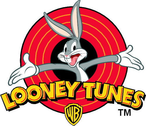
Whilst I have been exploring logo and coming up with ideas (see previous post) I have come across these three logo. The looney toons logo has stood out the most to me because of its vivid colour range and composition. The composition has been the most help to me as I am developing a logo for my box that has my 'company' in bold text with a female character popping out of it. In my opinion the arms presenting Looney Toons makes the title stand out because bugs bunny becomes the center of attention so you know what it is about therefore you associate Looney Toones with comical comedy/fun. Also only 5 colour in a similar tonal range are used to keep it simple and not over complicate the design.

Everyone recognises this Logo. It has helped make Starbucks what it is today. Although i am not a fan of Starbucks the logo is very well designed. The two colour work well together to express a 'natural' (green) and serious (black) theme. To add to the natural theme a woman is the centre of the logo to promote Starbucks 'caring' nature.  It also implies that if you buy coffee from Starbucks you are buying the best due to the crown on top of the woman's head and of course it has America written all over it because of the Stars (especially on the crown.) 
Until today I have never heard of Kidlink but its logo has stood out to me because of it simple, linear design that advertises a bold, trustworthy company because of the combination of the structured text and the smiling faces. There is also a sense of 'togetherness' because of the interlinking faces which adds to the sense of people being able to bond with the company.

From looking at all of these logos I think I am going to work on my company/person logo. I am going to experiment with colour to provoke emotion, line to simplify the design and give it structure, text/font to express the friendliness of my personality and the gestures of the person I have drawn to provoke emotion in my audience.