Showing posts with label client project. Show all posts

Wednesday, 13 April 2011

Validation Process

I have validated all of the main pages of the website. It document type is XHTML so it is a bit stricter than standard HTML.

The errors that arose are below.
One of them was that that some browsers don't support the cursor hand but only supports pointer. This just refers to the type of icon used to show that it is a clickable image.
Next error= Z index
The Z index signifies the stack order of an element. This means that the Z index only works when the positions of elements are set to fixed, relative or absolute.
This is one of the problems caused by the tags in the ditto call, connected with the Hpfeatured and HpfeaturedTPL
This means that script language is wrong it should be script type instead
This error is referring to the border "0" being referenced constantly so should be set in the CSS as a div class to create cleaner code.
Result- Homepage validated!
Validating the 'About Us' page

Extra div in the foot section

Monday, 11 April 2011

To have HTML5 or not to have

My original plan was to explore HTML5 intensively throughout the duration of the client project but I had to adapt to the clients requirements. The most important element that changed my mind was that they needed to be able to constantly update their website so I had to learn a content management system. This would allow the client to be more flexible with the content and be able to update the website whenever needed. This will keep more people interested in the website for longer and ensure repeat visitors as they will come back for updates on events etc.

One of the main issues of HTML5 is that I would've had to make two websites as HTML5 isn't compatible with older browsers. Originally I didn't realise how long learning the content management system would take so thought I could still complete both learning a new content management system (Modx) and do HTML5. I have finished slightly early so I am exploring the basics of HTML5 and its potential.

http://www.smashingmagazine.com/2009/07/16/html5-and-the-future-of-the-web/ The first thing that I have noticed is that HTML5 is structured differently with tags such as
All of these sections, particularly
Another element that I have been recommended to explore my a fellow website designer is a HTML5 boilerplate.http://html5boilerplate.com/

Sunday, 10 April 2011

The Footer

Although this section isn't seen as the most important part of any website it is a detail that I think can make or break a website. It is a standard area of a website that people expect to be there and hold additional details. In the case of charities they are usually social widgets or some type, charity details, address and contact details.

My original problem with the footer is that it doesn't seem to go with the design of the rest of the page. It seems separated by the line created by the div box. The client wants the footer to include the charity details-contact, legal details (charity number etc). Also through talking to ibrow media, the website designer has recommended that putting a second navigation in the footer is good practice as it means people don't have to scroll to find where they are therefore making it easily to navigate.

When you wish upon a star have requested that their Twitter account and Facebook account be added to the footer to make the charity have a stronger online presence. This will give the target audience more options to keep updated with what the charity does.

Original Mock-up=small footer can't fit all of the charity information in.
Footer 2= bigger to fit in all of the information in, green to integrate it into the colour scheme of the rest of the website. Facebook icon needs the CSS altering to move it into the middle.
Final Footer

I have used the hand drawn line from the hills illustration to integrate the footer with the main website. Centralized the widgets to give the footer some symmetry. Changed the colour of the footer from green to a mid blue to give the website some balance with the colour scheme and so it goes with the sky and charity colours. Overall I am very happy with the footer design I think that it brings the website together. It makes a simple block of information interesting to look for a wide range of people.
To create a footer with an uneven line presented me with a few problems so I had to create an extra div to provide me with the space to add padding so that the green line would overlap the faded white background instead of being covered by it.

Within Modx I created a div id called widgets and set the width and height to 50 along with setting the image to source to the hand drawn facebook logo. I made sure the border was 0 aswell.

Wednesday, 6 April 2011

Sponsorship Page

The sponsorship page has always been a bit of a task for me as it is a lot of information and logos to display on one page. The challenge is how to get people interested in a series of logos that may not necessarily interest them. Also it is important that I take into account the companies that take priority as they have contributed substantial amounts of money as well as the smaller companies/individuals. So I have decided to create a image that will contain the logos and constantly be changing so that each sponsor will have equal amounts of time at the top. This will be at the top of a series of 3 logos that will change, at random each time the page is refreshed that way no company is seen to be preferred.

Also by formatting it this way it means that the page won't 'grow' too big with each logo that is added therefore making the audience scroll too far and get bored.

Below is a basic diagram of how the page is structured. I have created it using the same code as the news ticker on the homepage, except in Modx I changed it to the marquee settings so it flickers in and out rather than scrolling up and down.
Creating the sponsorship pages in Modx

I had to create an individual page for each logo/sponsorship so that the audience can interact (if they wish) with each sponsor equally and find out more information about them. This ensures that each sponsor gets equal coverage. Also creating each page helps to connect the logos with the fading in and out logo.

To ensure that all of the logos are presented well and load quickly I saved them for web to a 72 res. I saved them all in a supporters folder so that the client can choose which logos are presented from a folder.
I made sure the page is published in Modx so that it can be viewed as part of the live website.
Click icon to browse folder of uploaded images that I had altered in photoshop.
Take away the image size so the image doesn't pixilate. If i kept the dimensions in the logo would automatically try to format itself to those dimensions.

Tuesday, 29 March 2011

The Events Page Carried On

In some ways the events section is one of the most important pages of the website, if not the most important as it is the section that will inform the audience of that is going on within the charity. It gives them the key information and quickly if they want to get involved. I have done this through the interactive map so that they know where it is and don't have to deal with a lot of information. It gets the audience involved in the website.

My next aim was to make the individual events stand out in a similar way to the information. I did this by redesigning the calender icon in photoshop so that the text stands out. I altered the CSS in dreamweaver to make the a block space for the image with a margin to separate the text.
See the .supporters for the CSS I added to it.
However the text wasn't clear enough so I made the red section of the calender bigger so the text was clear.
Code for calender image above
Here come the Modx bit. I created a template variable called {{list-events-tpl}} it sets teh date, tells the links to look for [~+id+~}, which means look for the div id with the styles and pick up the date [+date+]
Final result of icons highlighting the events

Attracting and keeping the audiences attention of the events page

My goal for the Events page was to create a format that would make it easy for the audience to know exactly when, where, who to contact and what website to visit quickly. So I have used icons along with a bold title to make the information eye catching. This means the audience doesn't have to spend ages searching for information or get bored of looking for it.

To add in the icons I had to create a div id for each, changing the name of the image, adding a class to position the icon and I referred it back to [*Eventphone*],[*Eventemail*]etc changing it for each icon so that it picks up the template variable that will style it in Modx. The * means that the template variable will refer to the page that I am now on.
The code above create the icons below
That I then styled into all of the defining icons. At first it was adding the email icon in the wrong place so I had to take out

Final result of specified event page

Sunday, 27 March 2011

Adding Up-dateable Content in Modx

I have constantly been in contact with the client about what content she wants in the website. She has provided me with a word document, containing all the information, photos etc that she wants included in the website. From there it is my job to ensure that I provide a easy to use, flowing way that she can update the content in the future. It also has to be in a way that fits the style of the website.
Again I have followed the structure of the previous pages of adding content (within Modx). The client adds the content into title, long title, intro text and then the main content area. Modx styles it according to which area it is put into e.g. the title and intro text will be in a bold, dark blue text and the main content will be in a normal, black text.

I have learnt that it is important to but the text into the document with the insert icon within the Modx interface. If I just copied and pasted it into the general text area in Modx it tends to add code into it from word. However by doing this it doesn't completely get rid of unwanted code it has added breaks instead of paragraphs

at time which I have had to go through and alter in the 'edit HTML' section.
Another really good thing about Modx is that you can alter the content/layout of the website in the front end. I have experimented adding pictures through the front end (only work in the browser you have logged into Modx with).


First you go to the quick edit section, manage picture and choose the files that you want to upload then press the upload button. It then accesses the gallery code that I have created to format the photos.
Final look of the photos.
To create the gallery I have 'nicked' the code from the images that I have on the homepage (3 pictures that can be up date able) however again I have altered the code to adjust the size and position of the photos. As you can see from the screen shot of the code below I have changed the height from 500 to 250 and changed where it links to

The Donate Button

The donate button is a big part of how When You Wish Upon A Star will gain funds. It is an eye catching illustrated graphic that I hand drew and altered in photoshop (using my graphics tablet).

After sizing it in photoshop and creating the space for it (going by the chosen mock-up) within the website using CSS I created a div in Modx. This is the basic code that that any template variables or ditto calls will relate back to. Because it is just a click able image no ditto calls are needed just a link to the donate now page that will give the audience plenty of simple options to donate. By having two options to donate (a button image or text within the navigation it will attract more people). It adds extra functionality and user ability by having two options as different people may respond better to images or text.

After creating the div id in modx I copied the source code back into dreamweaver so that I could work with the CSS.

The supporters page: Modx style

My next task was to set up the 'Our Supporters' page so that the client can easily in put new content. This is one of the pages that needs to be constantly up date able.

This is the main template that I created that will be refereed to in the main document so that I don't have to duplicate code. It will also refer back to this code.
For the template to work I had to use a ditto call. A ditto call is a templating command that lists data from documents to create content in many different formats. Through using a ditto call I have been able to specify what data/layout that the data is presented in.

In teh code below I have changed it so that the content is presented in the order that it is edited on &sortBy`editedon`. Also I have changed &tpl=`testimTpl` to refer to the supporters page template &tpl=`testimTpl` to &tpl=`supporterTpl`. This will get all the correct data that I have specified in the supporters page template.


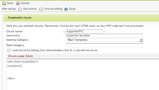
I started by creating a new template called supportersTpl. One of my aims throughout teh website is to keep the text of the website in a simpler format so I have always included text in the Long title, Description (so that the client gets extra guidance of what to write in that section), Documents alias (helps to locate it in the left hand side bar), Summary (intro text)-When You Wish Upon A Star can enter text in here to keep up with the format of the other pages, Menu index-places it within the navigation in a suitable place, Uses template- MainTemplate refers to the styling of the other pages that are under that template so that I don't have to keep duplicating code.
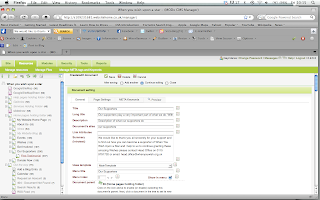
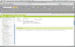
The only other alteration I had to make to this template to make it fully functional was to make it refer to the right page within the ditto call. I changed what parent page that the ditto call refers to on the left hand side e.g. &parents=`206`. This just tell that template to go to the main supporters page that happens to be referenced as 206. At first it didn't work because I had typed in supportersTpl instead of the proper template name that is supporterTpl. This just goes to show that adding one letter can through the code off course. As I have always known you have to be VERY precise in the code used.
Whilst creating these templates I have realised how much using a content management system benefits the user and myself as a website designer as the content can be altered through one ditto call/chunk/template instead of having to keep altering everything in dreamweaver that within a second can change the whole website. Most of all for this project it has helped me learn about what system is used in the industry and how this benefit the client. I am glad that I have learnt more about content management systems as I feel it has made my work more professional. As I have had to learn so much about content management systems in such a sort amount of time I have had to reconsider what my priorities are to learn. HTML 5 and CSS3 have taken a back seat in terms of learning new skills but intend to experiment with them a bit but not include them in the website as the client needs the content management system to be working and look at its best before I delve into that new technology.

The search box

For the search bar I altered some ajax code that I put into a chunk labeled {{search}}. &addjscript='0' means that no I don't want javascript to be applied to this section and showResults=`0` means that no I don't want the results to be shown. 0=yes 1=no within the code.
The only problem is that the search bar appeared as below so I had to apply some CSS to style how I wanted it to look.
This is the CSS that I used to style the search box.

The most important elements out of this section is the image that provides the background for the search bar. Also I made the font height 100%, which applies to the line height being used to its maximum.
Overflow set to hidden to prevent overlapping of text typed into the box overlapping the search bar. overflow:hidden;
This part is used to style the label 'search' so that everyone knows what it is.
This is to style the text that goes into the search bar.