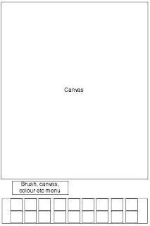
Wire frame 1: This is a simple art app that presents all of the elements to create art work with in the main canvas. Although there won't be as many formal elements to choose from this would be an easy to use app that is quick to use for ideas.
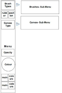
 Wire frame 2: I have been studying what tools are included on art apps and none of them have a clear section for canvas types. I think that this is a very important aspect as it replicates what we do when we create physical artwork. One of our first thoughts as artists is what canvas we are going to use and what medium is going to be used on it. Inevitably this effects what the texture of the medium will turn out like. Art apps are lacking in this department, artists are looking for a product that is easy to use yet doesn't loose qualities that working in a physical medium would give you.
 Throughout this wire frame I was focusing on how the formal elements options are presented.
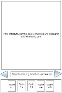
 Wire frame 3: This is a simple art app but I have focused on the menu as a scroll tool to the left and right so that the audience can interact with the tools easily rather than searching through a lot menus they have instant access to it on the user interface. The simplicity of this design would give artists a place to quickly sketch ideas and send them on quickly. I think that an older range of artists would be more attracted to this rather than art students (around 18yrs old).
 Wire frame 4: This idea has taken a new turn away from a pure art app. Going back to my feedback from Ashfield School. I want to combine art and game as an app to attract young artists. I have based this layout on Angry Birds, as it was a very popular game amongst the students that they were easily addicted to. They said that they liked the simplicity of the aim of the game to aim the birds.
 Wire frame 3: This is a simple art app but I have focused on the menu as a scroll tool to the left and right so that the audience can interact with the tools easily rather than searching through a lot menus they have instant access to it on the user interface. The simplicity of this design would give artists a place to quickly sketch ideas and send them on quickly. I think that an older range of artists would be more attracted to this rather than art students (around 18yrs old).
 Wire frame 4: This idea has taken a new turn away from a pure art app. Going back to my feedback from Ashfield School. I want to combine art and game as an app to attract young artists. I have based this layout on Angry Birds, as it was a very popular game amongst the students that they were easily addicted to. They said that they liked the simplicity of the aim of the game to aim the birds.
 I think an art/game app could replicate this by introducing a canvas with a picture on that you have to recreate by slingshotting the paint. However before this the audience would have to choose the formal elements through the menu on the left hand side. I think that the students would keep more engaged with this than a pure art app. It would also introduce them to using the formal elements in a different way, in a form that they can connect to.

No comments:
Post a Comment