So far I've done three mock-ups. I want to create something simple with a clean layout yet shows people my creativity/ skill set automatically.
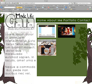
Mock-up 1
- I don't like this at all the trees send out the wrong message. The original idea was to have my tools 'growing' out of them but this doesn't suggest website designer to me...
- I like the position of the logo though. People will instantly see it.
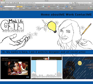
 Mock-up 2
- I'm getting there... So far I think the different segments for an illustrated header, navigation and a few pieces of selected work compliment each other because the audience automatically get a taster of my website design at the same time as my illustration skills.
- I don't think the blue works. It separates the page too much.
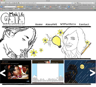
 Mock-up 3
- So far I like the banner with my illustrations. I chose images that represent me but I may play about with them to introduce text. Maybe make the illustrations change every once in a while to keep the audiences attention??
- The navigation is easier to see due to the hand drawn line guiding the eye.
- At the bottom I have done arrows so that the user can navigate through the previews
- Maybe add more colour into the logo to link it to the illustration?
- Add text introducing myself in the illustration...

No comments:
Post a Comment